Business dashboards are information management tools used to track KPIs, metrics, and other key data points relevant to a business, department and its objectives. With the right data visualizations, dashboards simplify complex data sets to tell its audience a clear and understandable story.
Dashboards are not venues for artistic impression. That’s because the purpose of business dashboards are to provide relevant and timely information; that captures the attention and teaches valuable lessons.
Here are 8 tips to design better business dashboards.
- KNOW YOUR KEY PERFORMANCE INDICATORS (KPIs): KPIs metrics tied to a target based on a business objective. The most important role of a business dashboard is to tell the audience if the business is achieving its objectives. KPIs represent how far a metric is above or below a pre-determined target. To reassure the audience your dashboard is going to present a complete story, KPIs should be the first thing your audience see.
- BE AWARE OF HOW DATA SAVVY IS YOUR AUDIENCE: Will the end-user be familiar with the data or are they new to the data? For familiar users, ensure that the metrics and visualizations align with the standard way the business is using the data. For new users, make sure to give the visualizations and fields intuitive titles, and to align the metric to familiar business goals. This dashboard can include text boxes to reinforce the point the charts clearly convey.
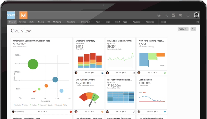
- USE FAMILIAR CHARTS: Use charts managers and executives already know how to read these and assimilate. Line, Bar and Pie charts may not be new or sexy, but they ground the story you want to tell with familiar landmarks. Maps can also give an immediate signal of the area to be discussed. Use unfamiliar, highly multidimensional chart types (x/y, heat/treemaps) with caution — these are best used for analysts working across broad data sets as part of exploratory interactive data visualization.
- KEEP CHART SIMPLE: This applies to charts themselves too, where “less is more.” The aim should be to communicate the data with as little visual “noise” as possible. In practical terms this means averring the use of unnecessary decoration, chart backgrounds that add no meaning, redundant text, 3D visualizaion and grid lines — anything that adds nothing to the communication of the data or worse obscures it.
- SELECT THE RIGHT CHART FOR YOUR DATA: The primary charts to consider for a business dashboard are:
- Line Charts – A Line Chart is an effective graph formed from a series of data points connected by the eponymous line. They are often used to show developments over time and identify trends.
- Bar Charts – Perhaps the most common misconception about charts and dashboards is that more is better. Bar Charts are a simple and effective way to look at different values and segments (like sales by region) and provide clear and compelling analyses and comparisons.
- Pie Charts – These charts are often the subject of controversy. Data visualization guru Edward Tufte writes, “pie charts are bad and that the only thing worse than one pie chart is lots of them.” No matter how you feel about pie charts, the only time you should use them is when you need a graph representing proportions of a whole, when the total of your numbers is 100%.
- Tables – Tables are great for detailed information with different units of measure, which may be difficult to represent easily in a graph or chart.
- Gauges – This type of graphic typically displays one or more values using indicators and appropriate metrics. They are often used in dashboards to highlight a specific KPI that needs attention.
- Area Charts – Area charts are awesome for multiple data series with part to whole relationships, or for individual series representing a physically countable set.
- EMPHASIZE KEY VALUE IN CHART WITH NUMBERS: Although the right chart is the best way to display a set of data on your Excel dashboards and reports, you still might want to call attention to the top values in that chart. The selective use of numbers can point out key information or highlight a specific period making your point without the need for text.
- ALLOW DRILL-DROP CAPABILITIES: Just as you go from the front page to deeper pages within a news site, a business user often has to drill into the details beyond the data to determine what business action is called for. A report or graph displaying a trend is nice, but what is useful is drilling into the detail to see what is causing the trend and in what area the business user needs to take action.
- DESIGN FOR THE MOST POPULAR PLATFORM: How will your users interact with your application? Will they view it on their iPad, on a full resolution PC, or on their smartphone? Knowing the platform which your users prefer is key to building a powerful and usable interface.
Well designed business dashboards are remarkable information management tools. But don’t forget the purpose it serves. To guide your audience to making better decisions because they have been told a story that presents a complete picture from beginning to end.
Did these tips help you design business dashboards? Does your business need help creating a better business dashboard?