
Executive dashboards can be powerful business tools.
They are visual representations that summarize complex information in an easily digestible way. Effective executive dashboards present a clear picture and tell a story that makes a compelling case for action,
The person or team that creates an effective executive dashboard are seen as strong analysts and great manager of a business.
If being perceived in this light is important to you, here are 6 examples of executive dashboards that wow the “C” suite and why.
#1. KPIs:
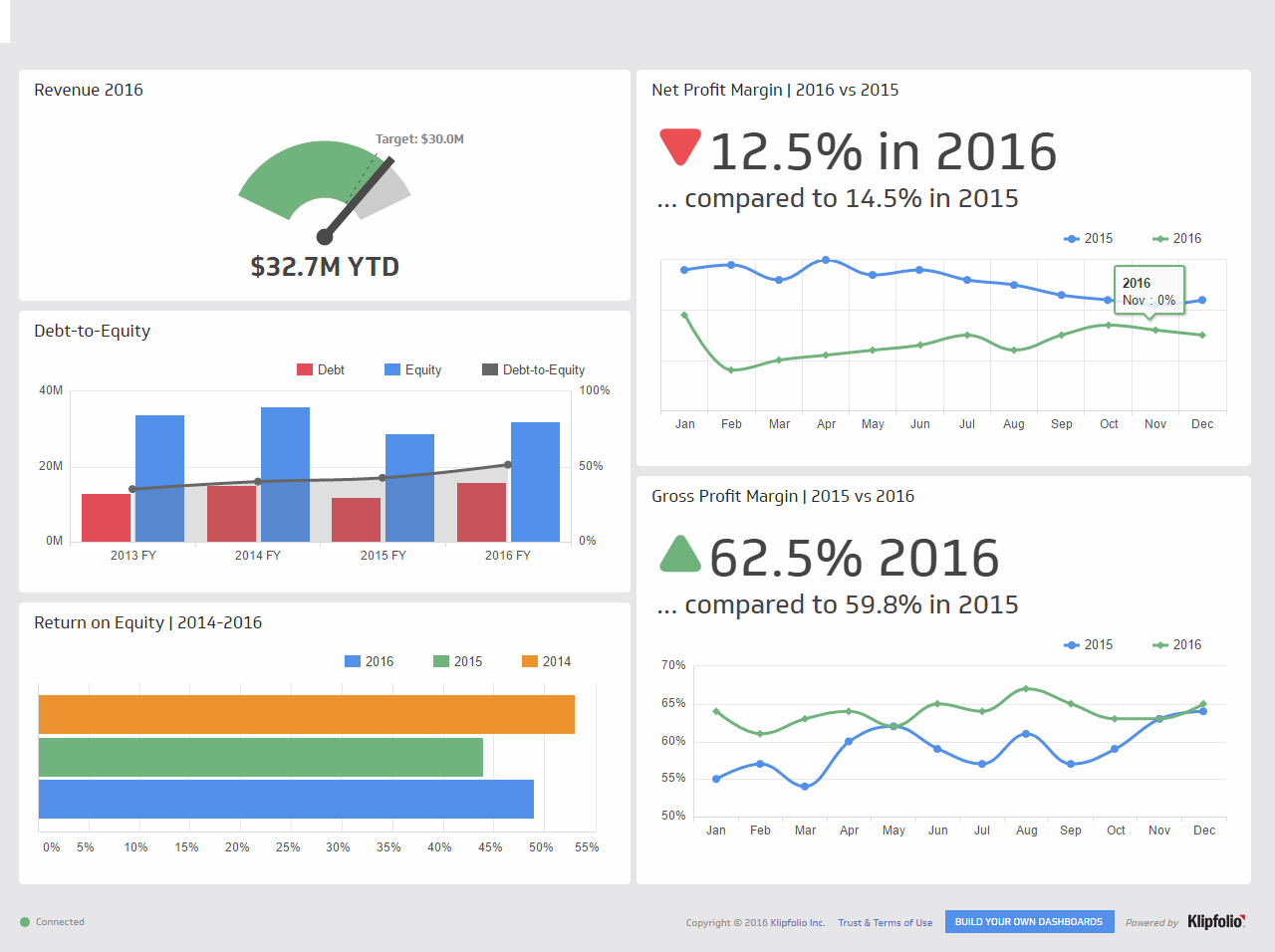
The most important consideration of executive dashboards is they show the right measurements, the metrics that matter to the “C” suite. KPIs (Key Performance Indicators) are measurable values that demonstrate how effectively a company is in achieving its key business objectives. In most cases, KPIs for an executive dashboard begin by showing fiscal performance – sales, profits or revenue. Then, they might feature key customer metrics (e.g. visits, leads, cost per acquisition (CPA), conversion rate, customer lifetime value (CLV));and then factors effecting these measures (e.g number of customer complaints, performance by region, marketing).
#2. CLEAR ORGANIZATION 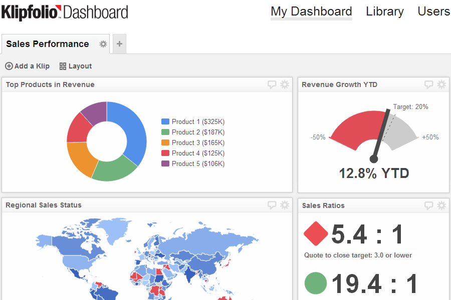
Executive Dashboards are particularly effective when all key information is placed on one page. The organization of the charts, information and key takeaways has to clearly lead people Most people read left to right and top to bottom. So, consider the best chart to present specific measurement and how you organize them. The chart above clearly shows at a glance sales by product, sales progress, global sales and ratios of over and under achievers.
#3. CHART TYPES
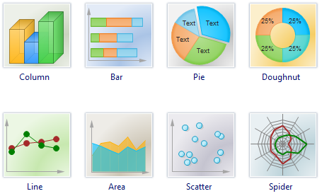
Software and data visualization tools have gotten pretty sophisticated for executive dashboard. Charts types found most often on executive dashboards are:
- Line Charts – A Line Chart is an effective graph formed from a series of data points connected by the eponymous line. They are often used to show developments over time and identify trends.
- Bar Charts – Perhaps the most common misconception about charts and dashboards is that more is better. Bar Charts are a simple and effective way to look at different values and segments (like sales by region) and provide clear and compelling analyses and comparisons.
- Pie Charts – These charts are often the subject of controversy. Data visualization guru Edward Tufte writes, “pie charts are bad and that the only thing worse than one pie chart is lots of them.” No matter how you feel about pie charts, the only time you should use them is when you need a graph representing proportions of a whole, when the total of your numbers is 100%.
- Tables – Tables are great for detailed information with different units of measure, which may be difficult to represent easily in a graph or chart.
- Gauges – This type of graphic typically displays one or more values using indicators and appropriate metrics. They are often used in dashboards to highlight a specific KPI that needs attention.
- Area Charts – Area charts are awesome for multiple data series with part to whole relationships, or for individual series representing a physically countable set.
- Maps – Maps are effective for regional differences or a highlighting a key metro area or city
#4. DRILL DOWNS
Executive dashboards for the “C” suite are meant to show a high level view. But you never know how deep into a particular area some one might one to go. Charts on executive dashboards show either the ability to be created so additional information can be added to the high level view to get deeper into a particular areas or time.
#5. TEXT BOXES
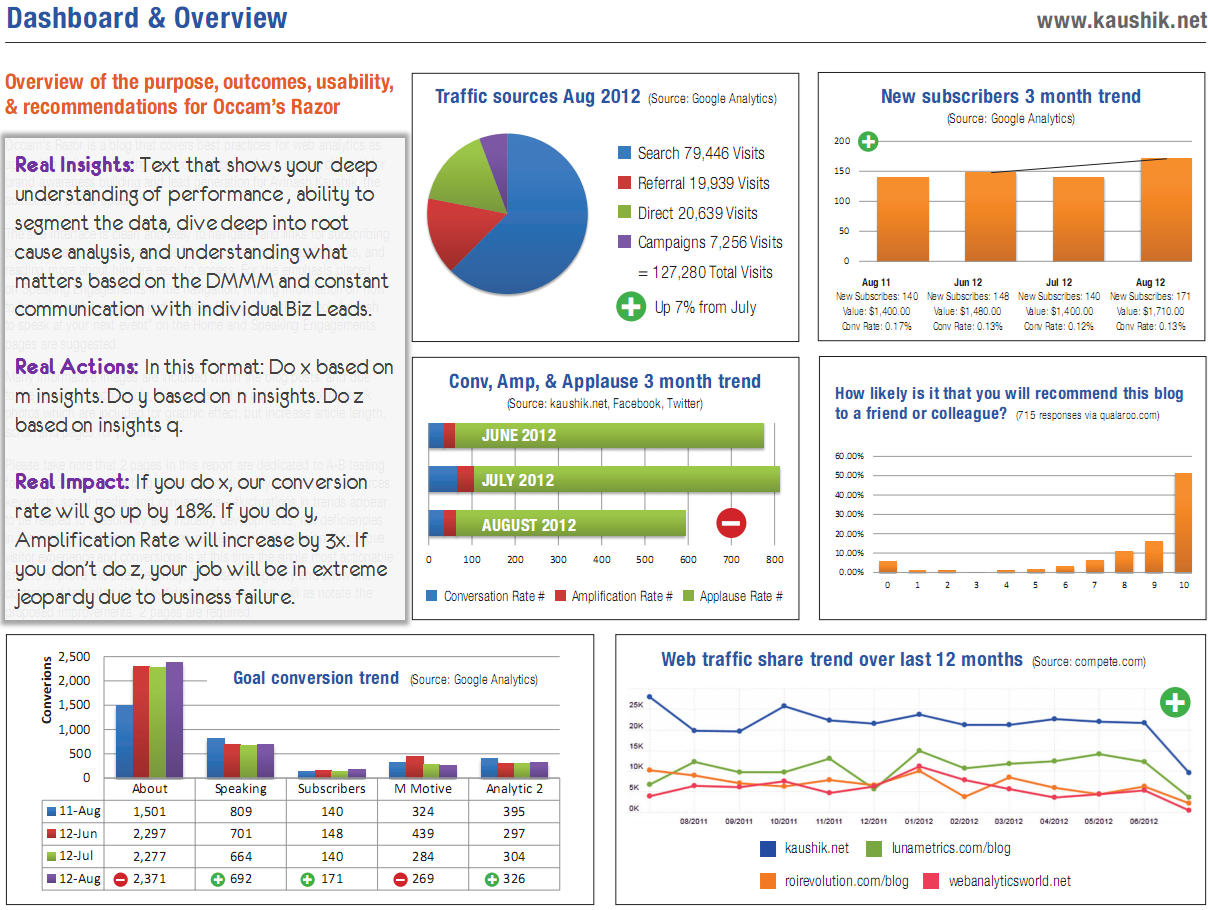
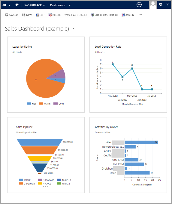
Don’t expect everyone will walk away from a chart with the same conclusion as you. The chart above from Avinash Khausik, Digital Evangelist at Google, shows how text boxes should be used. Don’t be afraid to use text boxes to make your point, provide insights and give actions. People appreciate when the path and the plan are presented for them.
#6. INDICATED ACTION
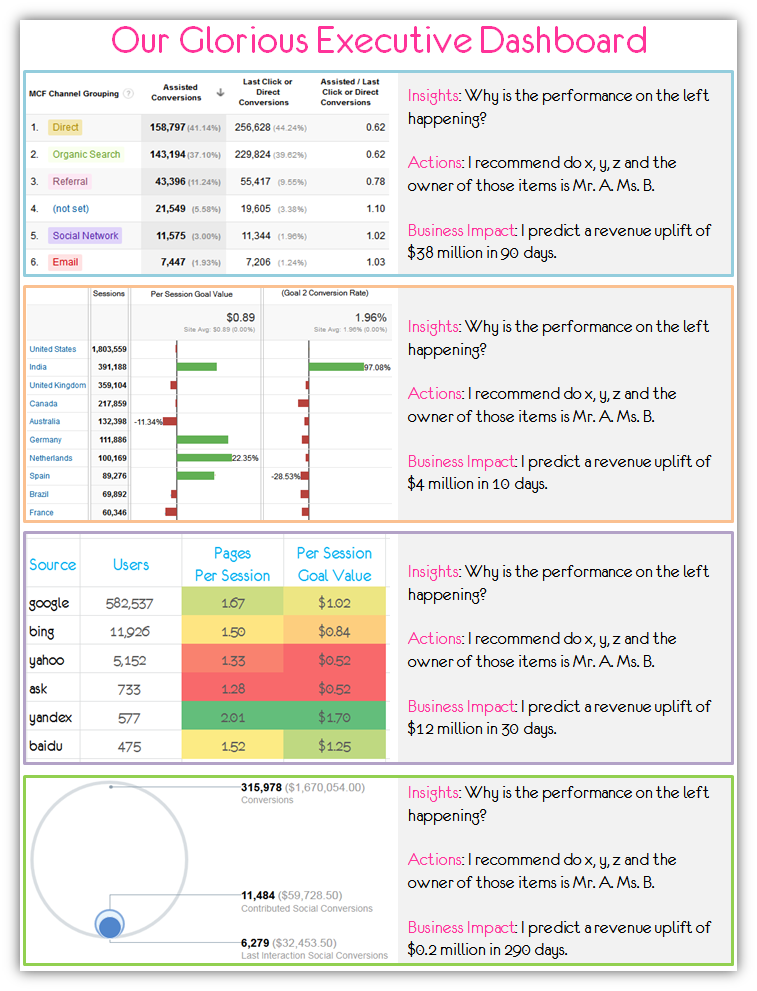
A strong presentation of key data is going to impress the “C” Suite. What is going to delight them is if the actions to be taken are also included and their impact is projected. The is the primary purpose to the dashboard. The dashboard above, also from Avinash Kaushik, states actions and, because the data has been analyzed, quantifies business impact.
Do these examples show why executive dashboard can be such powerful tools? Does your organization need to get started with one?