- 91% of marketing leaders believe successful brands use customer data to drive business decisions (source: BRITE/NYAMA)
- 87% agree capturing and sharing the right data is important to effectively measuring ROI in their own company (BRITE/NYAMA)
- 40%-60% annual growth increase is occurring in the volume of data available every year; in media intensive sectors and financial services, the increase is 120% (source: Fathom)
The facts indicate company leaders believe understanding data is a critical component to business growth. And more of it is coming at us in ever increasing rates.
Data visualization is the art and practice of gathering, analyzing, and graphically representing empirical information. More and better data visualization tools have come to market from software services like Tableau, Fusion Charts, Google Charts and Visual.ly to help better display data. So, there is no reason business leaders shouldn’t be able to fulfill their data dreams.
But it’s not the data. It’s what you do with it.
Software doesn’t find the insights in the data, people do. Before companies jump into Big Data, they should be asking: Have we mastered the principles of little data?
To help, here are 8 guidelines for great data visualization.
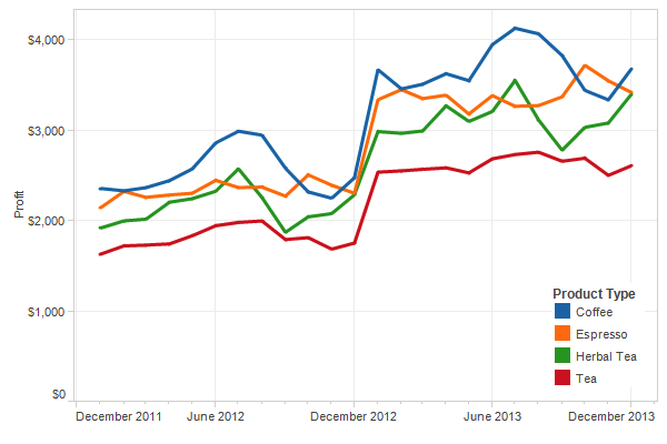
- BEGIN WITH BASIC DATA PRESENTED AS SIMPLY AS POSSIBLE: Great data visualization begins with measurements that are readily available, come from a reliable source and are easy to understand. For example, the line chart below for a coffee shop chain uses just profits by key beverage and time. But it shows very clearly what types of drinks are going to be the most profitable and when. It gives all the information the owner requires to order, promote and maximize revenue and profits.
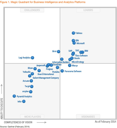
- CHOOSE AXISES THAT ADDRESS KEY STRATEGIC ISSUES: If you want data to provide answers, you have to set it up by addressing the right questions. How you choose and define your axises serves as a primary guide. The chart below plots software companies based on based on their “vision” and “ability to execute.” The axises address a key strategic issue that can provide answers like likely winner and losers based on positioning and competitive advantage. The company data is telling because the criteria is clear.
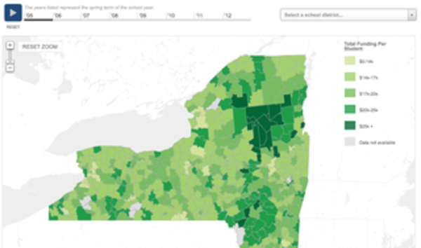
- PROVIDE A USABLE LEGEND: The definition of the legend plays an important role in motivating action. The data visualization below of expenditures per student for New York state schools offers a telling picture of where education monies are going, what are areas of greatest need and how they might be redistributed.
- ESTABLISH SEGMENTATION: If you want actionable insights from data, it helps to establish segments or groupings that create differentiation. The chart below shows the Top 100 Entrepreneurs, divided into three segments. From this chart, it’s clear that not all entrepreneurs are created equal. If you want to understand what makes great entrepreneurs, the data tells you to focus on the “Rocket Ship” segment and probe into what makes them tick.

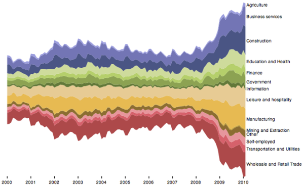
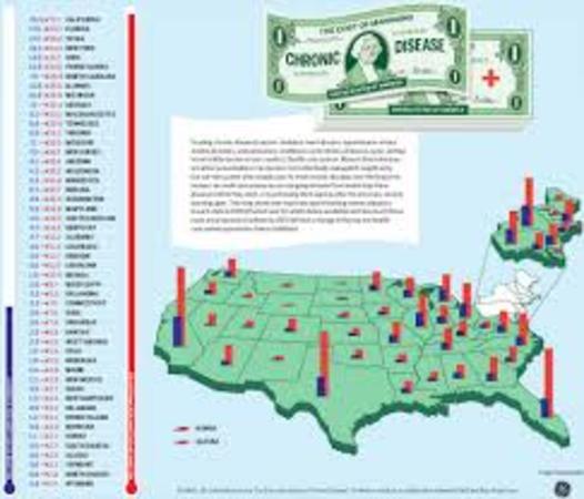
- FACILITATE DISCERNMENT WHEN SHOWING A TIME SERIES OR GEOGRAPHY: When showing time or geography, incorporate colors, coding, history or forecasting to provide perspective or context that shows where things are headed. The “stacked graph” below on unemployment in the US by industry (time series) and the cost of chronic disease care (geography) show how how to display time series and geographic data, effectively.
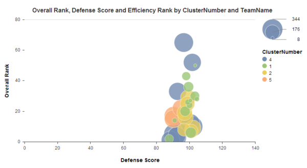
- IDENTIFY CLUSTERS: When looking at many variables, use clusters to show the data in ways that creates groupings that lead to conclusions. The Cluster Analysis below was created to identify the college basketball teams that were most likely to win the NCAA’s based on defense. As you can see, clustering the many variables that were examined helps to clearly show the teams that have the most potential.
- TELL A STORY WITH THE DATA: Good data analysts are storytellers. Effective data visualization is often helped with text. Simple headlines or text boxes help explain what the data is saying and the actions that should be taken. This example below from Avinash Kaushik, Digital Marketing Evangelist at Google, shows how data visualization might be presented to the C-Suite.
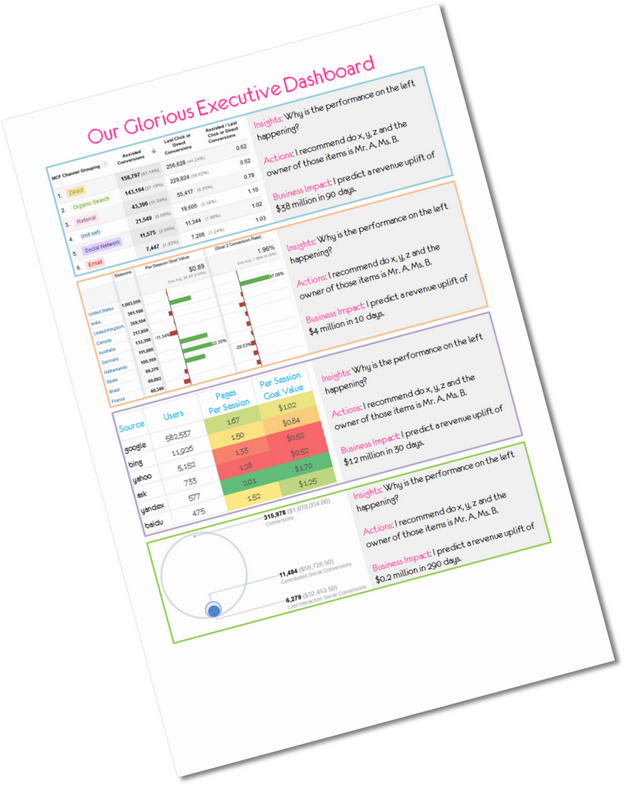
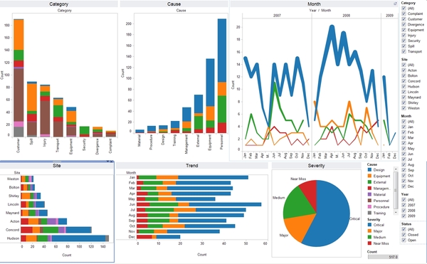
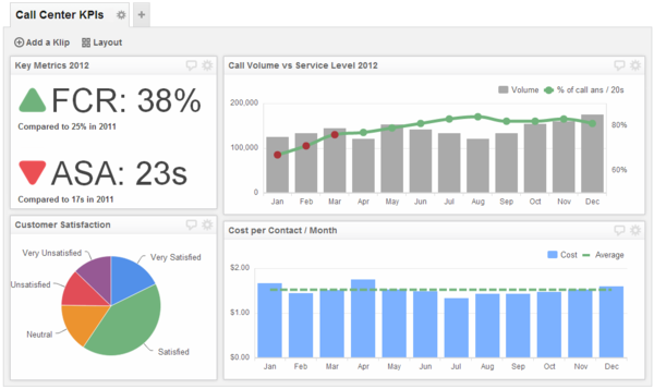
- CREATE AN ACTIONABLE SCORECARD: The data dashboard your company creates should be based on Key Performance Indicators. KPIs are one of the most over-used and little understood terms in business development and management. They are too often taken to mean any metric or data used to measure business performance.The role KPI’s play is much bigger and more important. In fact, KPI’s are one of the most important guideposts for any business. Every business should have them. Here’s one of the best definitions I’ve heard: KPI’s are an actionable scorecard that keeps your strategy on track. They enable you to manage, control and achieve desired business results. The KPI dashboard below for a call center is simply laid out, easy to understand for decision making and incorporate a little from each of the previous critical components.
If your business needs help using data to make better decisions and ROI, consider BarnRaisers, because that’s what we do. Or, considering taking a Mini-MBA from the Rutgers Business School Executive Education where I teach Measurement and ROI.
Do these key components help you see how data visualization can help your business?