
Big Data is amazing. It describes our everyday behavior, keeps track of the places we go, stores what we like to do and how much time we spend doing our favorite activities.
Big Data is made of numbers, and I think we all agree when we say:
Numbers are difficult to look at.
Enter Big Data visualization.
Google, Facebook, Amazon, Apple, Twitter and Netflix all ask better questions of their data – and make better business decisions – by using data visualization.
It gets better:
Data visualization lets you interact with data. It goes beyond analysis. Visualization brings a presentation to life. It keeps your audience’s eyes on the screen. And gets people interested.
You might be wondering:
How do I get a clean and engaging visualization for all my data? Will it be time consuming? Am I going to spend months preparing everything?
Here’s the deal:
There are tools that help you visualize all your data in minutes. They are already out there. All you need to do is pick the right tool that suits your needs.
Whether you’re looking to wow your audience at your next presentation or you are a developer looking for a practical way to visualize large sets of data, there are amazing tools out there for both parties. So many that it’s hard to find the right tool for your project.
Want to know the best part?
We made everything easy for you and prepared a series of reviews that cover all the features of the best data visualization tools out there. And we divided our reviews in two sections: data visualization tools for presentations and data visualization tools for developers.
Here are reviews of our 20 best tools for Big Data visualization.
Data Visualization Tools for Presentations: Zero Coding Required
Your data is all in a spreadsheet. Ready to go. All you want is to visualize it beautifully and maybe add a few smart interactions. And make a killer presentation. If this is you read on and enjoy our list of amazing data visualization tools for presentations.
1. Tableau

Tableau is the big data visualization tool for corporate. Tableau lets you create charts, graphs, maps and many other graphics. A desktop app is available for visual analytics. Don’t want – or can’t – install software on your desktop? A server solution lets you visualize reports online and on mobile. A cloud hosted service is also an option for those who want the server solution… but don’t want to set it up manually. Customers of Tableauinclude Barclays, Pandora and Citrix.
2. Infogram
Infogram lets you link their visualizations and infographics to real time big data. And that’s a big plus. A simple 3-step process lets you choose among many templates, personalize them with additional visualizations like charts, map, images and even videos, and you are ready to share your visualization. Infogram supports team accounts for media publishers and for journalists, branded designs for companies and classroom accounts for educational projects.
3. ChartBlocks

ChartBlocks is an easy-to-use online tool that requires no coding, and builds visualizations from spreadsheets, databases… and live feeds. A chart building wizard does all the magic for you. Your chart will be created under the hood in HTML5 by using the powerful JavaScript library D3.js – read our developers review of D3.js below – and your visualizations will be responsive and compatible with any screen size and device. You will also be able to embed your charts in any web page and share it on Twitter and Facebook.
4. Datawrapper
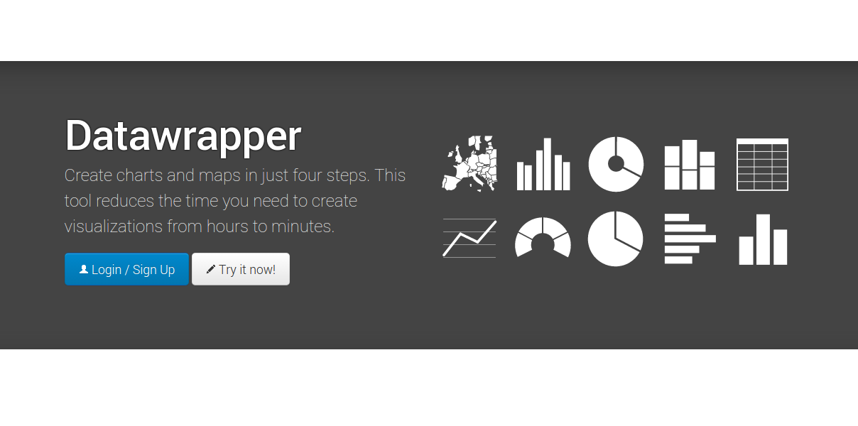
Datawrapper is aimed squarely at publishers and journalists and is adopted by The Washington Post, The Guardian, Vox, BuzzFeed, The Wall Street Journal and Twitter – among the many. Datawrapper is easy and requires zero coding. Upload your data and easily create and publish a chart or even a map. Custom layouts to integrate your visualizations perfectly on your site and access to local area maps are also available.
5. Plotly
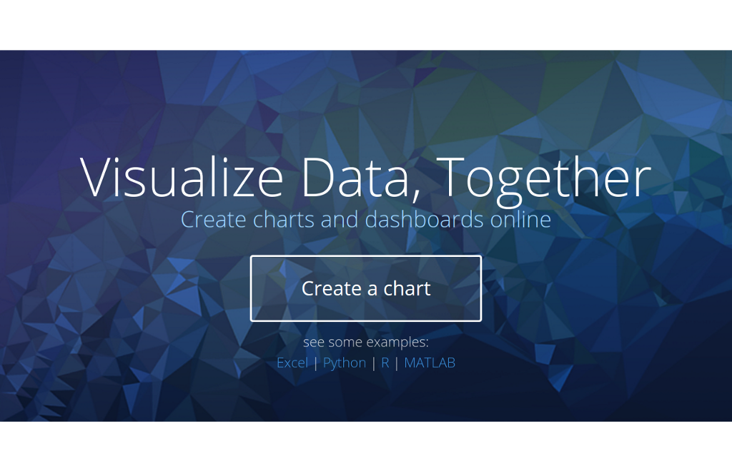
Plotly will help you create a sharp and slick chart in just a few minutes, starting from a simple spreadsheet. Plotly is used by none other than the guys at Google and also by The U.S. Air Force, Goji and The New York University. Plotly is a very user-friendly web tool that gets you started in minutes. If you have a team of developers that wants to have a crack, an API is available for languages that include JavaScript and Python.
6. RAW
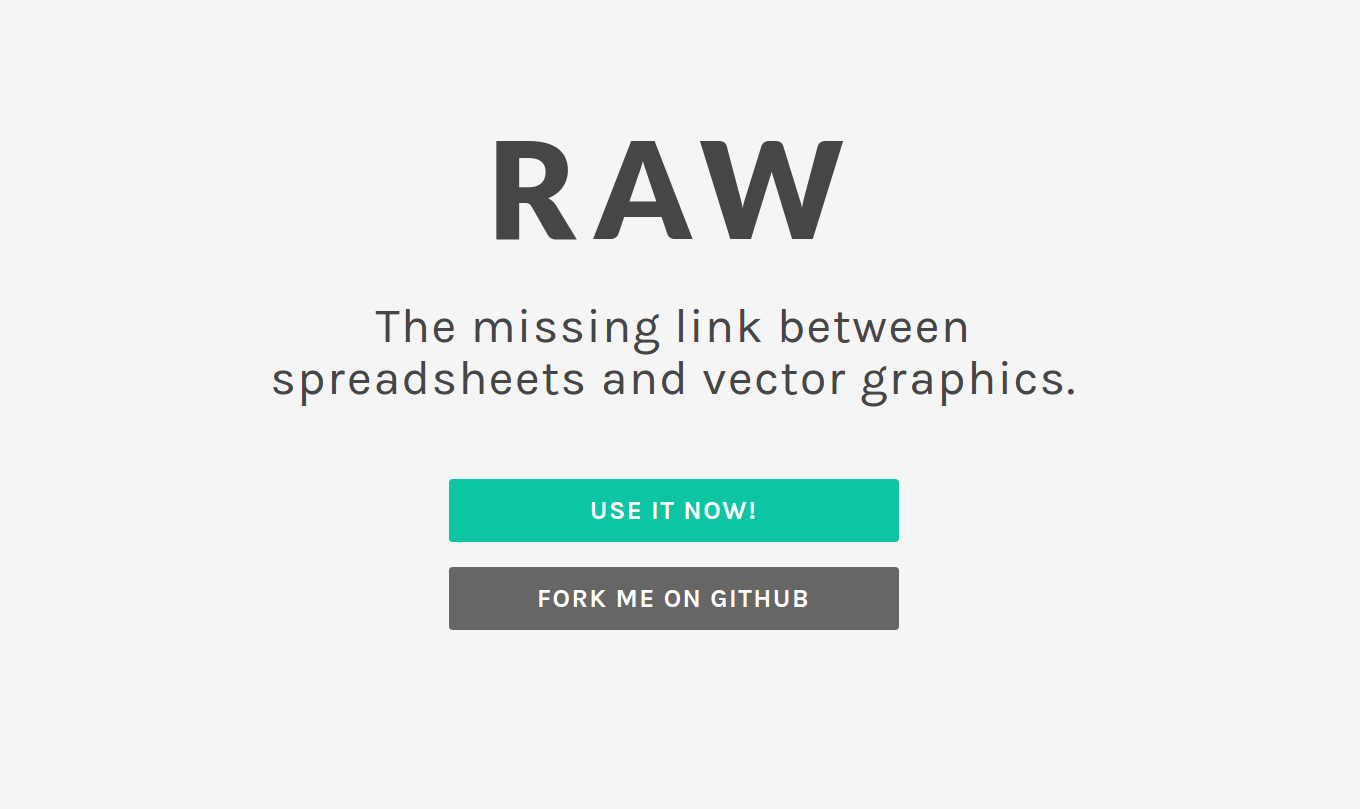
RAW boasts on its homepage to be “the missing link between spreadsheets and vector graphics”. Your Big Data can come from Microsoft Excel, Google Docs, Apple Numbers or a simple comma-separated list. The kicker here is that you can export your visualization easily and have a designer make it look sharp as RAW is compatiple with Adobe Illustrator, Sketch and Inkscape. Easy to use and quick to get results.
7. Visual.ly

Visual.ly is a visual content service. I decided to include it because they do have a dedicated big data visualization service and their portfolio is impressive: it includes work for VISA, Nike, Twitter, The Huffington Post, Ford and The National Geographic. If you want to entirely outsource your visualizations to a third-party you can do it through a streamlined online process where you describe your project and are connected with a creative team that will stay with you for the entire duration of the project. Visual.ly send you email notifications for all the milestones you are hitting, and will also let you give constant feedback to your creative team. Visual.ly also offer their distribution network for showcasing your project once it’s completed.
Data Visualization Tools for Developers: JavaScript libraries
And here is our developers list. This is for when all your data is in JSON or XML. You love APIs. You want to create gorgeous interactive data visualizations, put them on a web page and let the world see. JavaScript knowledge is highly recommended to make it through our developers list of extraordinary data visualization libraries.
8. D3.js

The best data visualization library there is, D3.js runs on JavaScript and uses HTML, CSS and SVG. D3.js is open-source and applies data-driven transformation to a webpage and – as you can see from their examples – allows for beautiful and fast visualizations. D3.js is also the absolute best to add data-driven real-time interactivity. Warning: this library is as powerful as it is cutting-edge, so it comes with no pre-built charts and only IE9+ is supported.
9. Ember Charts

Ember Charts is – as the name suggests – based on the Ember.js framework and uses D3.js under the hood.Ember Charts features time series, bar, pie and scatter charts. It’s very elegant and easy to extend. The team behind Ember Charts – the same that created Ember.js – put a lot of focus on best practices and interactivity. Error handling is graceful and your app will not crash when fed bad data.
10. NVD3
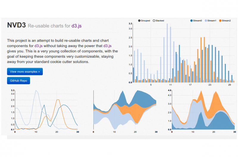
NVD3 runs on top of D3.js – surprise surprise – and aims to build re-usable charts and components. The goal of the project is to keep all your charts neat and customizable. NVD3 is a simpler interface on top of D3.js and keeps all its powerful features under the hood. NVD3 is developed by the front end engineers at Novus Partners and uses their insight in charting technology.
11. Google Charts
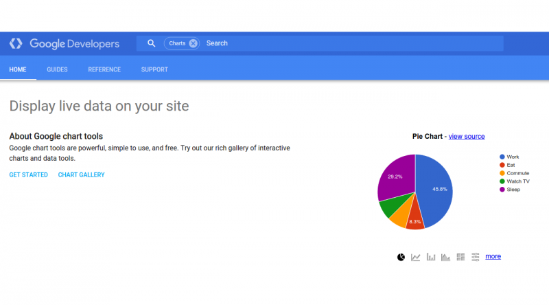
Google Charts runs on HTML5 and SVG and aims at Android, iOS and total cross-browser compatibility, including older Internet Explorer versions supported via VML. All the charts you will create are interactive and some are even zoomable. Google Charts is very user friendly and their site features a really nice and comprehensive gallery where you can see the kind of visualizations – and interactions – at your disposal.
12. FusionCharts

FusionCharts is – according to their site – the most comprehensive JavaScript charting library, and includes over 90 charts and 900 maps. If you aren’t particularly fond of JavaScript, FusionCharts integrates easily with libraries like jQuery, frameworks like AngularJS and React, and languages like ASP.NET and PHP. FusionCharts supports JSON and XML data, and is able to export your charts in a multitude of formats: PNG, JPEG, SVG and PDF. Among their products an out-of-the-box business dashboard is worth having a good look at.
13, Highcharts
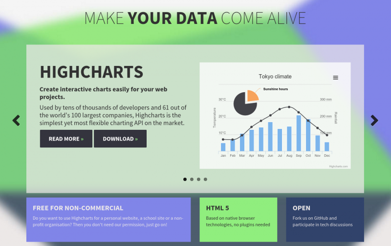
Highcharts is a JavaScript API that integrates easily with jQuery and boasts being used by 61 out of the world’s 100 largest companies. Charts are rendered in SVG and a VML fallback is available for older browsers. It offers two specialzed chart types on top: Highstock and Highmaps, and also comes bundled with a wide range of plugins. You can use it for free on your non-commercial projects or pay for a license if you’re interested in building a paid for application. Also, check out their Highcharts cloud service.
14. Chart.js
For a small chart project, Chart.js is your go-to place. Open source, tiny – ships at only 11kb – fast, easy to use, it supports six chart types: doughnut, pie, polar, line, bar and radar. What’s more, you can add and remove any of these 6 types to reduce your footprint. Chart.js uses HTML5 Canvas and ships with polyfills for IE6/7 support. The Chart.js GitHub page is skyrocketing in popularity and is definitely worth keeping an eye on if you decide that simple and fast charts are what your project needs.
15. Leaflet
Are you after a specialized Big Data map solution? No need for pie-charts and bar graphs? Leafleft leveragesOpenStreetMap data and adds HTML5/CSS3 visualizations and interactivity on top to ensure everything is responsive and mobile ready. You can use their extensive plugin repository to add heatmaps , masks and animated markers. Leaflet is open source and ships at only 33kb.
16. Chartist.js
Chartis.js is born out of a community effort to blow all other JavaScript charting libraries out of the water. It leverages Sass and styles are fully customizable, there is complete separation of concerns between CSS styles and JavaScript functions, and its SVG output is responsive – media query based – and DPI independent. And you can intergrate Chartist.js easily with AngularJS, React, Meteor, Ember and WordPress through a wide range of wrapper libraries – find out more on the Chartist.js homepage.
17. n3-charts

NVD3 runs on top of D3.js – surprise surprise – and aims to build re-usable charts and components. The goal of the project is to keep all your charts neat and customizable. NVD3 is a simpler interface on top of D3.js and keeps all its powerful features under the hood. NVD3 is developed by the front end engineers at Novus Partners and uses their insight in charting technology.
18. Sigma JS
Sigma JS is what you want for interactivity. It comes out-of-the-box with mouse and touch support, refreshing and rescaling, and renders on WebGL by default with an HTML5 Canvas fallback. The two data formats of choice areJSON and GEXF. Their plugin assortment for interactivity is massive. Sigma JS is a rendering engine specialized on drawing networks and graphs on web pages with a customizability that is unparalleled. If representing Big Data networks is your goal, use Sigma JS and don’t look back.
19. Polymaps
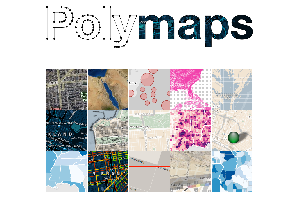
Polymaps visualizes…. you guessed it: maps. Polymaps is a JavaScript library that uses SVG to represent geographical data from country-wide level all the way down to your local street. You use CSS rules to style your visualization and your data can be easily interpreted by Polymaps via the GeoJSON standard. This is the best tool there is if you’re after creating heatmaps. All the maps you create can be interactive. And you can visualize cartography from OpenStreetMap, CloudMade, Bing and many other maps providers.
20. Processing.js
Processing.js is a JavaScript library that sits on top of the Processing visual programming language. As everyJavaSript library is, Processing.js is web oriented and lets you bring the Processing power to your web pages. This is the smartest visual interactive library there is. Processing.js requires an HTML5-compatible browser to do the magic. Do check out the exhibition page to see what this incredible JavaScript library is capable of.
Now it’s your turn
I just presented you with the best Big Data visualization tools out there.
Go and grab one.
Make your presentation smarter and impress everybody in the room with an interactive visualization.
If you’re a developer, make your app stand out with data that responds to a user’s actions.
All these tools are here at your disposal.
 Edoardo L’Astorina

Edoardo L’Astorina has 8 years of experience in software development. He has had a major role in the new Transport for London site and has developed sites and apps for JPC, The Crocodile and Miura. Edoardo started Blu Frame to help companies develop sites that stand out, load fast and are easy for users to access. Edoardo is passionate about risotto, Terrence Malick movies, Oasis songs and rowing. Edoardo is the founder of Blu Frame.
Terrific blog. Is there any end to the multiple applications one can find on the internet these days. Thanks for this very helpful guide. Jay
JayGronlund Thanks Jay. Appreciate the comment and feedback.