How to Write Winning Microcopy: 4 Hacks to Maximize Landing Pages ROI
There are many psychological barriers to conversions.
Consider these scenarios for instance.
Scenario 1: A new visitor enters a review website (like Yelp) and gets confused by the unfamiliar architecture. Distracted by pop-ups and menus, they lose sight of their goal. They either get lost exploring the site or abandon it altogether. That’s one conversion opportunity lost.
Scenario 2: A first-time customer reaches check out and starts typing their billing information. Unfortunately, they mistype some fields and are shown an error message. After several unsuccessful attempts, they leave in a huff, never to return again.
Sounds familiar, right?
Fret not. I understand your pain and I have the perfect solution to prevent these situations.
What’s that?
Learn to write winning microcopy.
But, What Is Microcopy?
Microcopy is the explainer text found in or around form fields, error messages, buttons and CTAs, and notification pop-ups. It gives context to users and guides them towards their goals.
Microcopy is used as specially designed fonts for exclusive looks. You can leverage the best sites to create your own font for your website landing pages. These specially designed microscopy fonts make your website unique looking and become some cases a brand image.
It keeps users on track so that they don’t drop off the sales funnel. Powerful, well-placed microcopy can move your audience towards conversion efficiently and help you grow your sales.
Think about it like this: You’re teaching your grandma how to use an Apple TV remote. The technology is new to her and like most people her age, she might be insecure about trying new things. So, you empathize with her, understand her fears, and put small labels above each button so that she doesn’t get confused. Voila!
That’s exactly how microcopy works. It:
- Provides reassurance to new users
- Puts them at ease so they start trusting your brand
- Guides them through the next steps
- Prompts user action
Another example, you are going to write a book on a complex psychological topic and want to write it in simple words with clear meaning. You have to understand how to write a book for your target audience. You can use powerful microscopy words to define hard words in a simple way.
In short, microcopy adds to the entire user experience, which eventually grows your conversions and revenue. Most of the good authority websites considered conversing content and if you want to contribute a guest post on their blog, then you need to write your content using relevant microcopy tactics. It increases your content marketing strategy results in a positive way.
Here’s how microcopy achieves the above in the two scenarios I described earlier:
In scenario 1, if the homepage had microcopy like shown below, it could have retained new visitors for longer.
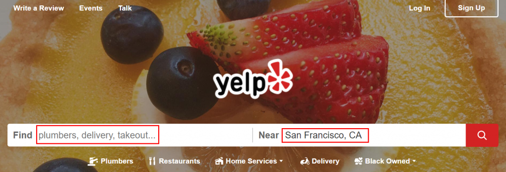
Image via Yelp
How?
The text “plumbers, delivery, takeout…” in the Find field would tell people how to start their search on the website.
Likewise, the example in the Near field (San Francisco, CA) would tell people how location-specific they can get in their search. Tiny tweaks like these can make a big difference to conversion rates.
In scenario 2, the form submission errors could have been avoided if an instruction (like highlighted below) was added to the billing form.
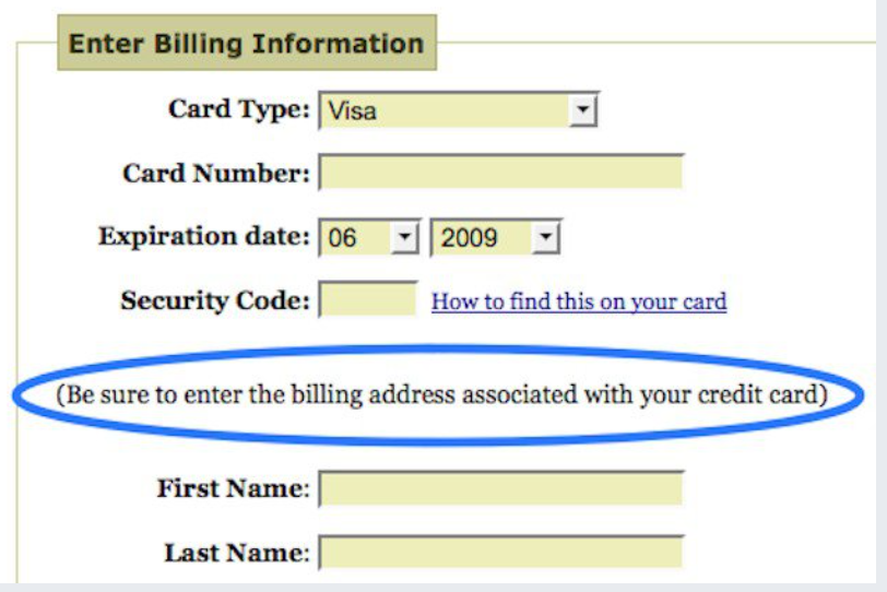
A small move like that can increase form submissions and reduce bounce rates. At the same time, it eases your support team’s workload and shortens conversion cycles by miles.
That’s the power of microcopy.
It is particularly useful when it comes to lead gen pages. These pages need crisp and compelling microcopy that can convert visitors into leads with ease. The idea is to use this short copy to get the visitors to give their information to you by filling up the form on them.
Need more evidence?
In a test conducted by an ace conversion optimization consultant from Unbounce, it was found that changing one word in button copy from “Order” to “Get” grew conversions by 14.79%.
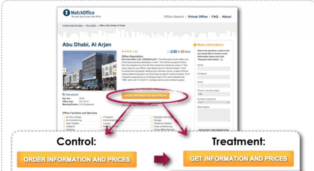
Image via Beem Digital
Your takeaway?
Focus on the small things when optimizing your website for better conversions. While website design and architecture are the pillars of UX, don’t neglect microcopy – it’s the key to keeping visitors on the page longer. You can’t avoid your website’s conversation rate optimization. it’s a necessary element of better-performing websites.
Take another example of an employee productivity calculator that adds features to their tool landing page in a clear and user-friendly manner. Employers can easily measure their employees’ productivity with a user-friendly tool. It helps to boost productivity at low cost and time-consuming.
4 Quick Hacks to Create Winning Microcopy
Now that you grasp the importance of microcopy, let’s learn the art of writing great microcopy.
1. Understand the User
You have to think from a user’s perspective and pre-empt their questions and needs. Then, craft microcopy that addresses those needs.
For instance, when a customer is transacting with you for the first time, it’s natural for them to be apprehensive about sharing their bank details. In such instances, adding a small note that says “Don’t worry, we don’t share your information with anybody” can be a gamechanger.
To create winning microcopy, exemplary copywriting is a must. But, more importantly, you need to have a deep understanding of your audience and a knack for converting jargon into language that appeals to them.
For example, If YouTube to MP3 converters designs their landing page of the tool as per their user expectations then definitely, they will build a great user base for their respective tool.
2. Keep Your Goals in Focus
You need to determine your goals from a page and create microcopy that helps you fulfill them.
Do you want to nurture your subscribers by sending marketing content to them? Then, say things like “don’t worry, we are not into spamming” to get marketing consent efficiently.
Need a real example?
Then, take a look at SaleCycle’s Customer Insights page. They use microcopy to explain how they plan to use shoppers’ contact details. The move inspires trust and streamlines marketing consent management. It also helps the company meet GDPR requirements and avoid legal hassles.
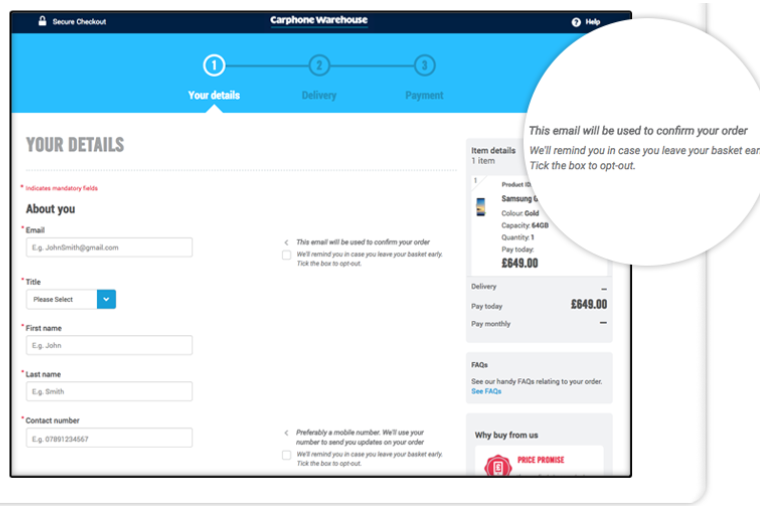
Image via SaleCycle
If your product/service is a specific niche, you might need helpful microcopy to explain how you can add value to people’s lives. Creating brand awareness should be your priority while crafting microcopy.
Honey is an app extension service that helps users find coupons and save money on online purchases. At first sight, their features and installation process may seem complicated. But the strategically-placed and simply-worded microcopy changes your perception.
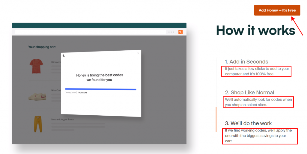
Image via Honey
In simple words, it explains how first-time users can use the service, putting them at ease instantly. Even the button copy is self-explanatory and compelling.
Microcopy can also be used to reinforce your branding and voice. When you have milliseconds to create a lasting impression, every element on your site (including microcopy) can be a branding asset. Self-explainer banners with microcopy can help you get better conversion, and you can create banners as per your need by leveraging a banner maker.
For inspiration, you can check out Shea Shea Bakery’s website. They have a unique concept – bakery-themed beauty products for guilt-free indulgence. Their microcopy supports the theme perfectly.
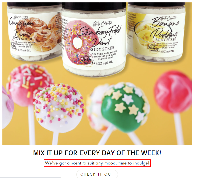
Image via Shea Shea Bakery
3. Adopt a Conversational Tone
Your team might be adept at product-speak, but it might be Greek to your customers. You can use microcopy to simplify complex terms and connect with your audience on a human level.
Good microcopy is natural, conversational, and even fun. For instance, check out this amusing error message from MailChimp.
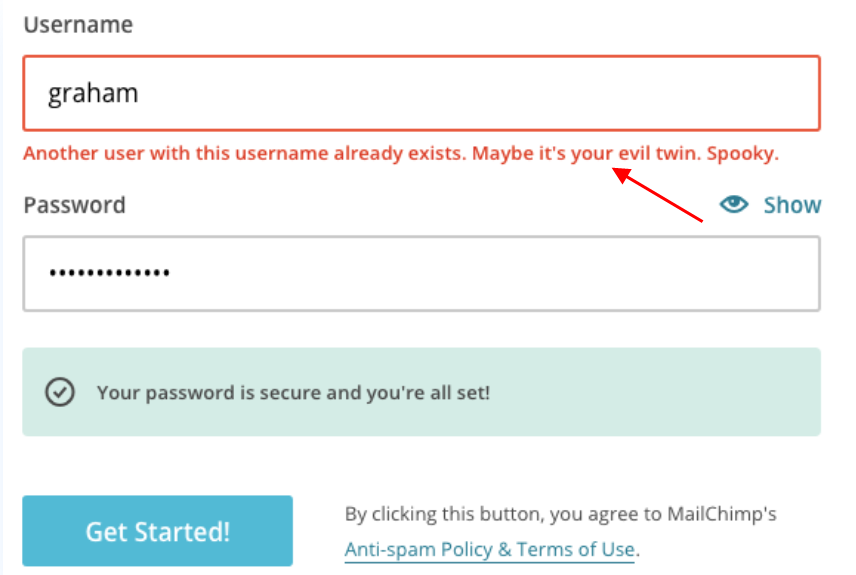
Image via MailChimp
Error messages can turn people off, but MailChimp softens the blow by keeping their messages breezy.
Microcopy should not only speak to the audience but also be brief and scannable. You don’t want to overwhelm them with huge text blocks. You should use microcopy sparingly – only to support your main website content. It shouldn’t be the star of your page. You need to avoid these types of mistakes while creating b2b content.
If you need to convey voluminous information via microcopy, use bulleted lists and paragraph breaks. In that sense, Lovehoney’s microcopy is an inspiration for copywriters. The brand sells lingerie and adult products – things that most customers are nervous about buying.
On the brand’s check-out page, microcopy neatly organized in a bulleted list tells how they protect user privacy and use card information discreetly.
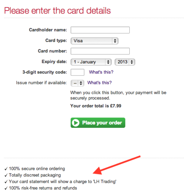
Image via Lovehoney
Since the microcopy is easy to locate and read, it puts nervous customers at ease and makes them less likely to abandon their carts.
4. Be Authentic
Some form fields and error notifications can trip users up more than others. Once you identify these problematic areas, you can use microcopy to reduce user errors and convey expectations clearly. This way, you can become a trusted brand for your audience.
For example, adding a line about your return policy (like Schuh does below) shows new customers that your intentions are honorable. After all, not many customers bother to go through terms and conditions with a microscope.
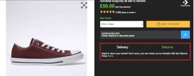
Image via Schuh
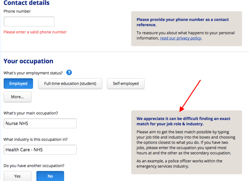
Here’s another example. In insurance forms, getting the job title right can be tricky. But if the field is accompanied by a simple explanation about what defines a role like “nurse,” you can earn audience trust and also get more form submissions. Additionally, You can also add testimonial examples that increase the authority.
Another example, Deuk Spine added their specialist picture with his work and expertise in short as “Eliminating Pain“. It increases the authority of the website as well as a clear understanding of what they are offering to their clients.
Pro Tip: Landing pages are the source of information for your visitors so you need to create them in converting way and include all elements so visitors can’t get confused and frustrated and he can get in an understanding way. For example, An online resume maker landing page for job seekers to create their effective resume.
Conclusion
Microcopy can be a powerful tool for brands, marketers, and website designers. Standout microcopy is intuitive, concise, conversational, and helpful. Since that’s quite a tall order, you can use the above hacks to get your microcopy right in the first go.
Do you need more copywriting advice? Share your requests in the comments section. I’m always happy to help my readers.

