
For ecommerce brands, getting people to visit their online stores is only half the battle. The real challenge is turning those visitors into loyal customers.
Most of your website’s visitors aren’t ready to buy just yet – they simply need a little nudge. Your product collection pages are the perfect spot to nurture these potential customers and guide them toward a purchase. These pages can be a powerful tool to boost conversions and build lasting customer relationships.
In this article, we’ll guide you through eight essential elements that can transform your product collection pages from average to exceptional. By the end, you’ll have a clear roadmap to optimize your pages, improve user experience, and see a real impact on your bottom line.
1. SEO-Friendly Descriptions
Indexable descriptions are your secret weapon for SEO. They help search engines understand what your collection page is all about, boosting your visibility in search results.
But they’re not just for robots. Well-crafted descriptions also give your human visitors valuable context and can spark their interest in your products.
Here’s how to craft exceptional descriptions:
- Include relevant keywords naturally – don’t rely on keyword stuffing.
- Keep it concise but descriptive – aim for 150-300 words.
- Highlight key features and benefits of the product category.
- Use HTML headings (H1, H2) to structure your content.
- Include internal links to relevant product or category pages.
- Update descriptions regularly to keep content fresh.
Let’s look at an example of this strategy:
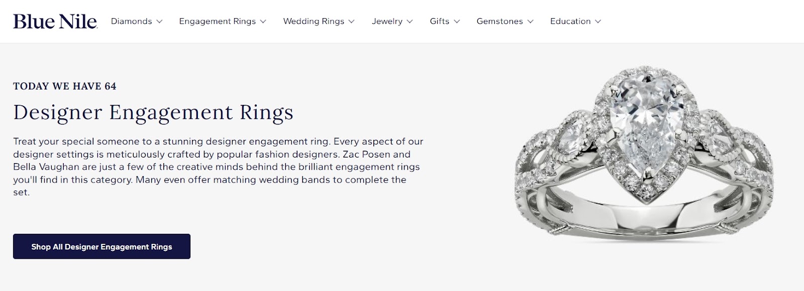
Blue Nile, a fine jewelry brand, sparkles when it comes to indexable descriptions on their designer engagement rings collection page.
They kick things off with a dazzling description that sets the stage for the stunning rings featured on the page.
Behind the scenes, they’ve carefully woven in strategic keywords that’ll help them climb the search engine rankings. Yet, the description doesn’t read like a keyword-stuffed mess. It flows naturally, enticing potential customers while quietly working its SEO magic.
Source: bluenile.com
By balancing beautiful prose with search-friendly content, Blue Nile is killing two birds with one stone. They’re drawing in both search engines and shoppers looking for the perfect ring.
2. Intuitive Filtering Functionality
Filters are your shoppers’ best friends. They help customers quickly find what they’re looking for, saving time and reducing frustration.
When visitors can easily narrow down their options, they’re more likely to find products that match their needs, leading to higher conversion rates and happier customers.
Here’s how to implement intuitive filtering the right way:
- Offer relevant filter options based on your products (such as size, color, price, material, etc.).
- Use clear, simple language for filter labels.
- Make filters easy to find and use on both desktop and mobile.
- Add multiple filter selections within each category.
- Show the number of results for each filter option.
- Provide a way to quickly clear all filters.
- Consider adding a “most popular” or “best sellers” filter to highlight top products.
Now, let’s take a look at two brands that crush their filtering game:
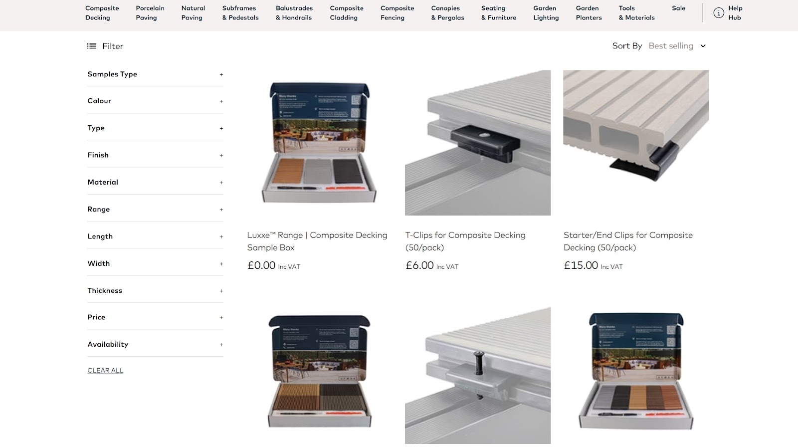
The first is Ovaeda, a brand specializing in outdoor living space products. They nail this strategy on their composite decking collections page.
They’ve got a large inventory, which could easily overwhelm shoppers. That’s why Ovaeda’s filters start collapsed, keeping the page clean and uncluttered. This way, visitors can expand only the options they need, giving them control over their shopping experience.
Source: ovaeda.com
This approach lets customers easily find what they want without drowning in a sea of irrelevant choices. It’s a win-win: shoppers find products faster, and Ovaeda keeps their page looking sleek and user-friendly.
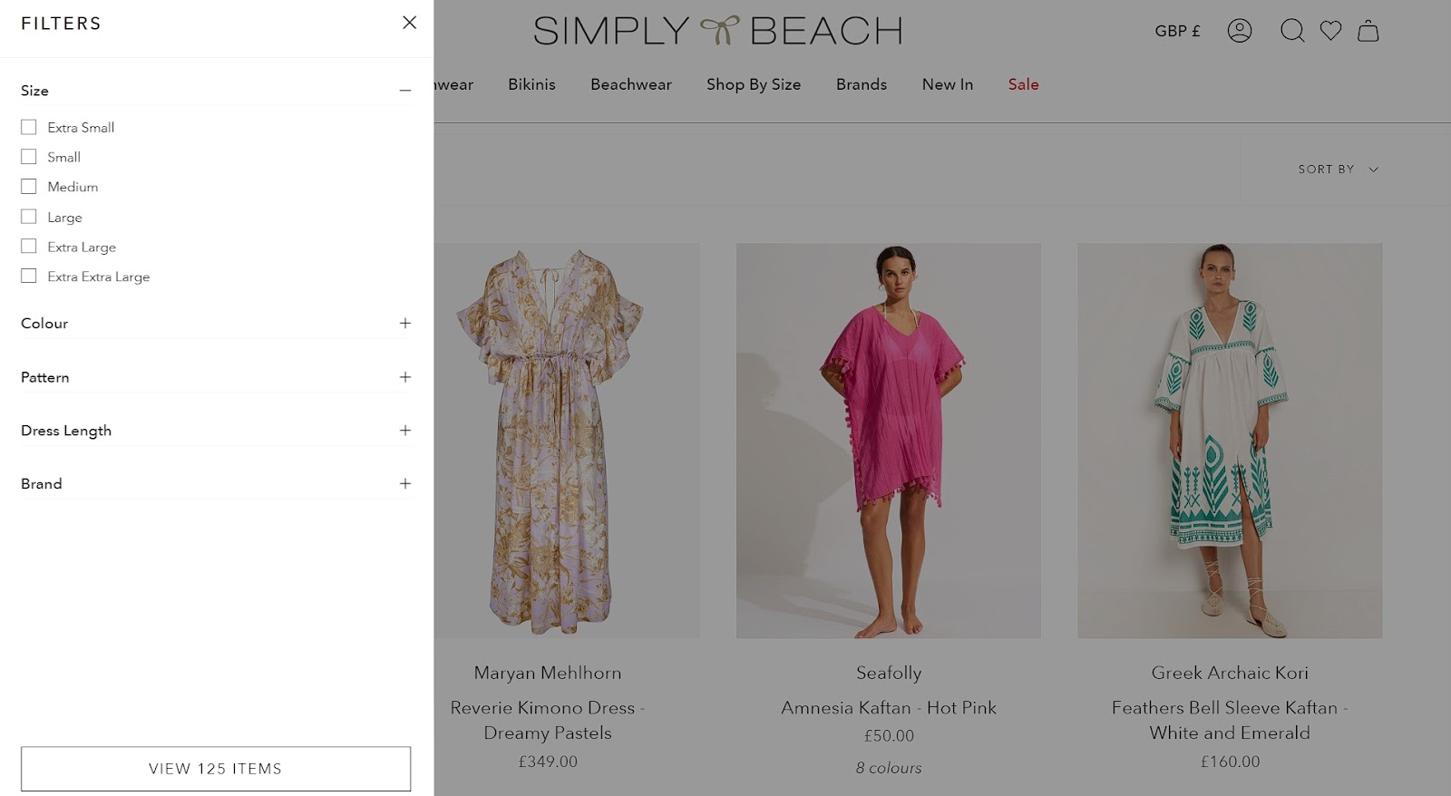
Another example is Simply Beach, a one-stop shop for swim and beachwear clothing. They take a minimalist approach to their beach kaftans collection page.
They’ve tucked all filtering options behind a single “Filters” button. Click it, and voila – all your sorting needs appear.
Source: simplybeach.com
This is a clever way to keep the interface sleek and uncluttered. It helps keep the viewer focused mostly on product images.
Both these examples show how smart filtering can enhance the shopping experience without overwhelming your customers. Of course, the goal is to always make finding the perfect product a breeze, not a chore.
3. Availability Indicators
Nobody likes falling in love with a product only to find out it’s not available in their size or preferred color. Availability indicators save your customers time and frustration by showing them what’s in stock at a glance.
This transparency builds trust and reduces bounce rates, keeping shoppers engaged and more likely to make a purchase.
Here’s how to display product availability:
- Use visual cues like color dots or icons to show available options.
- Display size availability directly on product thumbnails.
- Clearly mark out-of-stock items or sizes.
- Update availability in real time to avoid disappointment.
- Consider showing “low stock” warnings to create urgency.
- Allow filtering by available items only.
- Offer “notify me” options for out-of-stock products.
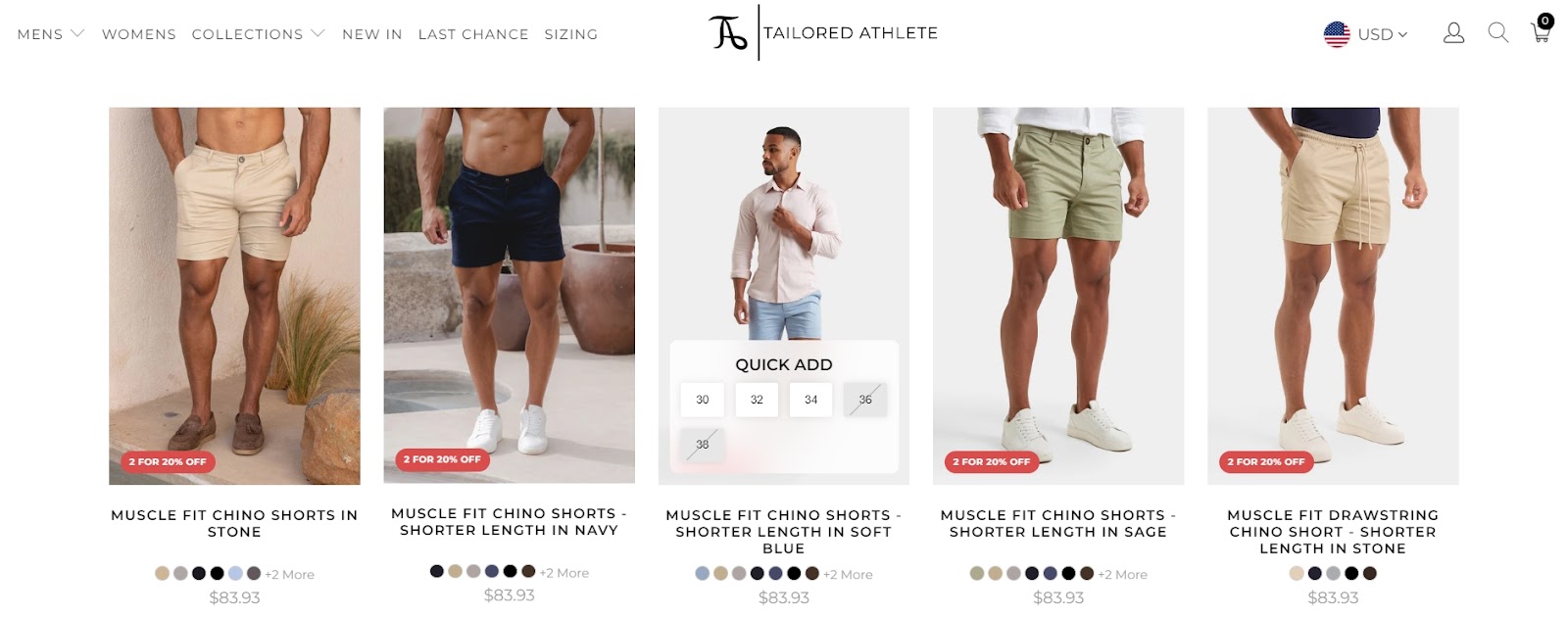
Tailored Athlete, a brand specializing in athletic fit menswear, crushes it with their availability indicators on their muscle fit tailored shorts collections page.
They use small colored dots below each product image to show available colors at a glance. But here’s where they get really cool: hover over a product, and all available sizes are clear as day, while out-of-stock sizes are crossed out.
Source: tailoredathlete.co.uk
This smart setup lets shoppers instantly see if their size and color combo is available without clicking through to the product page.
Following this strategy streamlines the shopping process, reduces frustration, and keeps customers engaged. It’s how you turn browsers into buyers.
4. Trust Indicators
A quarter of customers bail on their purchases because they don’t feel secure on a website. This trust issue starts way before checkout – it’s happening right on your collection pages.
Trust badges are a great remedy for this issue. They reassure visitors that you’re legit, your products are quality, and their data is safe. When shoppers feel confident, they’re more likely to stick around and proceed with their purchase.
Here’s how to effectively use trust indicators:
- Display customer ratings and reviews prominently.
- Show off any industry certifications or accreditations.
- Include secure payment icons.
- Highlight your return or satisfaction guarantee policy.
- Add logos of well-known brands you work with or media mentions.
- Use security badges to show your site is protected.
- Consider adding a live chat option for instant support.
Main Clinic Supply, a supplier of portable oxygen devices, knocks it out of the park with tons of trust signals on their portable oxygen concentrators collection page.
They’ve turned the left sidebar into a trust-building powerhouse. It’s packed with badges showing customer ratings, a BBB accreditation, low price guarantee, next-day delivery, worry-free protection, and secure payments.
To top it off, they even display the logos of media outlets that have given them a thumbs up.
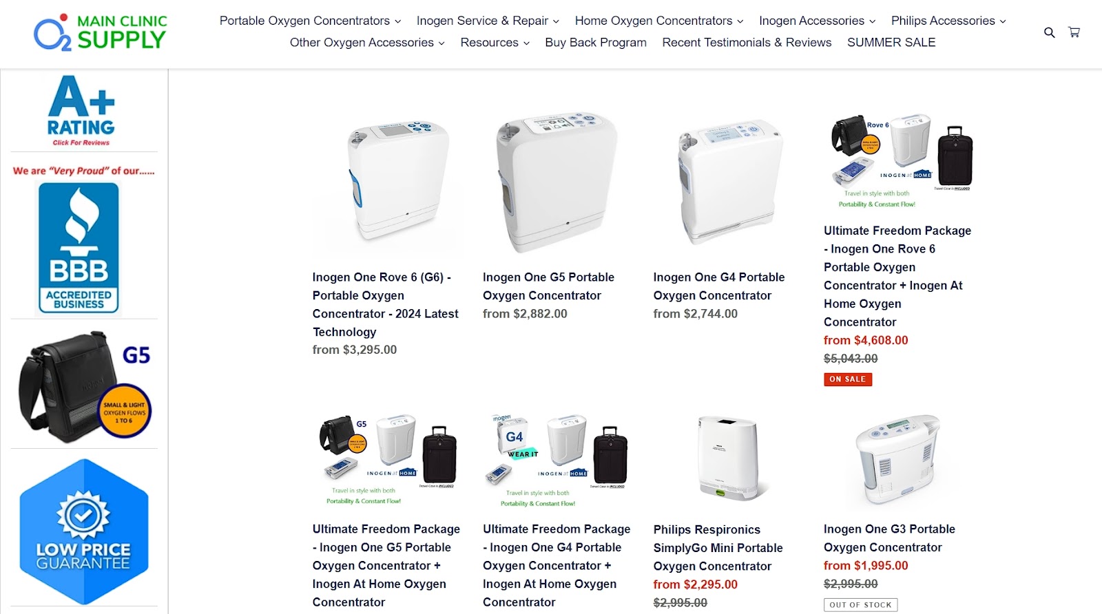
Source: mainclinicsupply.com
This is truly a smart move that often translates to more confident shoppers and higher conversion rates.
5. Multiple Product Views
Shoppers are visual creatures. Multiple product views give them a better feel for what they’re buying without leaving the collection page. It’s like window shopping, but better.
This feature reduces uncertainty, sparks interest, and can be the nudge that turns a browser into a buyer.
Here’s how to show more of your products:
- Display products from different angles on hover or swipe.
- Include lifestyle shots to help customers visualize the product in use.
- Highlight key features or details with close-up shots.
- Ensure your images are high-quality and load quickly.
- Use consistent image sizes and styles across products.
- Consider adding a quick-view option for even more details.
- Make sure your multiple views work smoothly on mobile devices.
Andar, a brand specializing in leather wallets, bags, and cases, implements this on their card holder wallets & phone cases collection page.
When you hover over a product image, it transforms from a standard studio shot to a realistic lifestyle photo. One second, you’re looking at a sleek wallet on its own; the next, you’re seeing it in action – often slipped into a pocket or held in someone’s hand.
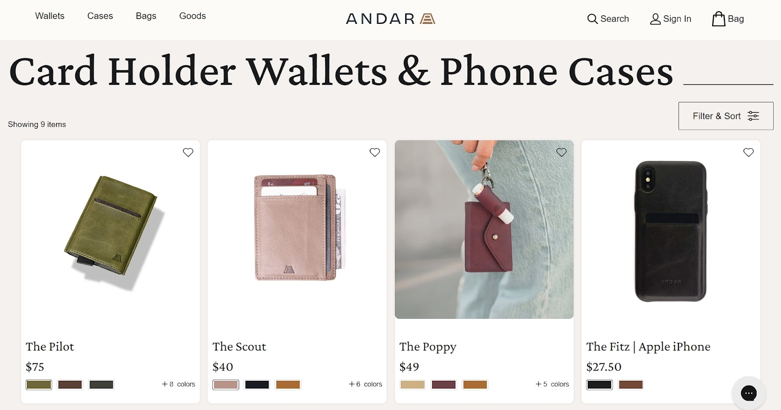
Source: andar.com
This dynamic approach does double duty. The studio shots give you a clear view of the product, while the lifestyle images help you picture owning and using it.
By bringing their products to life right on the collection page, Andar creates a more engaging, confidence-boosting shopping experience.
6. Anchor Prices
Anchor prices tap into our love for a good deal. By showing the original price alongside the discounted one, you enable a reference point that makes the discount more appealing.
This creates a sense of value and urgency that can nudge hesitant shoppers toward a purchase. It encourages impulse buying and can significantly boost conversions.
Here’s how to leverage the cleverness of anchor pricing:
- Always show the original price, crossed out, next to the sale price.
- Use contrasting colors to make the discounted price stand out.
- Calculate and display the percentage or dollar amount saved.
- Offer bundle deals to increase average order value.
- Use time-limited deals to create urgency.
- Be transparent about your pricing – don’t inflate original prices.
- Consider dynamic pricing for different product variants.
For an interesting twist, try creating a “value spectrum” on your collections page. Group your products into good, better, and best categories. This naturally anchors prices and helps customers understand the value proposition of each tier. You could even add a visual element, like a slider or color-coded system, to make it more engaging.
Another creative approach would be to use time as an anchor. Show how much customers save over time by investing in your high-quality products.
For example, “Save $2,000 over three years compared to cheaper alternatives.” This works especially well for durable goods or subscription services.
The most important thing here is to be transparent and honest. Use anchor prices to showcase your product’s value, not to mislead. When done right, it can be a win-win for you and your customers.
7. Star Ratings
72% of shoppers won’t pull the trigger on a purchase until they’ve read reviews. That extends to star ratings – the quick thumbs-up from previous buyers.
Star ratings build trust, save time, and help shoppers make decisions faster. They’re eye-catching little nuggets of social proof that can boost your click-through rates and conversions.
Here’s how to utilize your products’ star ratings:
- Display them prominently next to each product.
- Show the number of reviews along with the rating.
- Use half-star increments for more accurate ratings.
- Make sure the ratings are up-to-date and authentic.
- Allow customers to sort products by rating.
- Consider highlighting top-rated products.
- Link ratings to full reviews for those who want more info.
Beauty Pie, a luxury skincare and makeup brand, is crushing it with star ratings on their body care collection page.
They’ve gone beyond just slapping some stars on their products. Each item shows a clear star rating, but they also boast the number of reviewers behind each rating.
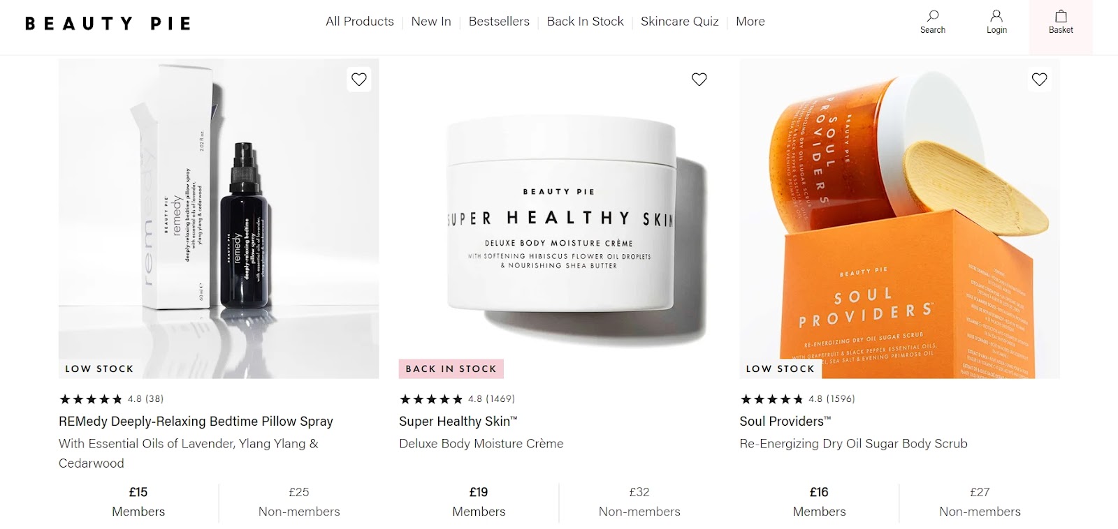
Source: beautypie.com
This approach is brilliant. It tells shoppers that a product is well-liked and shows them exactly how many people contributed to that opinion. It’s transparency at its finest, giving potential buyers the confidence to add to cart.
By combining star ratings with review counts, Beauty Pie is serving up a double scoop of social proof. In the beauty industry, that’s a winning formula.
8. CTA Buttons
Call-to-action (CTA) buttons are the signposts guiding your customers to the checkout. They make it crystal clear what action you want shoppers to take next.
A well-designed CTA button can be the difference between a browser and a buyer, turning interest into action with a single click.
This approach reduces friction in the buying process. It’s perfect for impulse purchases or for customers who know exactly what they want.
Here’s how to nudge visitors closer to becoming customers:
- Use action-oriented, specific text like “Add to Cart” or “Buy Now.”
- Make buttons stand out with contrasting colors.
- Ensure buttons are large enough to tap on mobile devices.
- Place CTAs in prominent, easy-to-find locations.
- Use hover effects to make buttons more interactive.
- A/B test different button designs and placements.
Nerdwax, a brand specializing in anti-slipping glasses wax, leads with their CTA game on their Nerdwax collection page.
They’ve got an “Add to Cart” button for each product featured on the page. It’s simple but seriously effective.
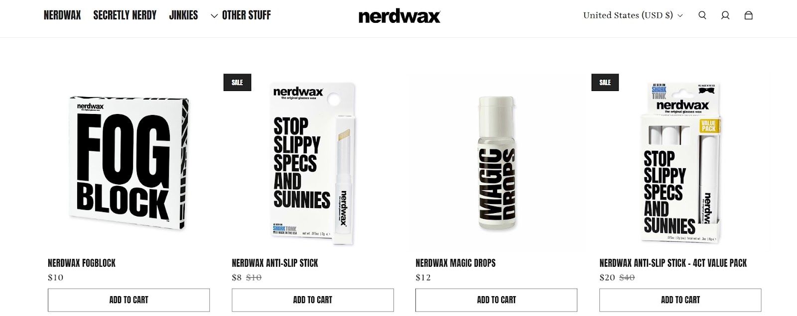
Source: nerdwax.com
By including a CTA with every product, Nerdwax is making it super easy for customers to take action right then and there. No need to click through to a product page if they’ve already made up their mind.
This element puts the power to purchase at customers’ fingertips, streamlining the path from browsing to buying. It enables a small detail that can lead to big results in conversion rates.
Final Thoughts
Enhancing your ecommerce product collection pages with these eight must-have elements can significantly boost your conversions and improve the overall shopping experience.
Each of the tactics above is designed to smooth the path to purchase and boost your bottom line. So, give them a shot and see how they perform.
Before you know it, you’ll have a collection page that looks fantastic and converts like crazy.