
Grabbing the attention of potential customers is only half the battle. The real challenge lies in converting that attention into action. It’s no secret that buyer hesitation can be a major roadblock in this journey.
Why do some visitors browse but never buy? It could be the lack of trust, confusion, or simply not finding what they’re looking for. That’s where website optimization comes into play.
Does that mean that you should make your website look pretty? Sure, but creating a seamless, engaging, and reassuring experience for your visitors is equally, if not more, important. By implementing strategic tweaks, you can address the common causes of buyer hesitation, turning skeptics into loyal customers.
In this article, we’ll dive into eight powerful strategies to overcome buyer hesitation. Each one is designed to enhance your website’s appeal and functionality, making it a potent tool in your marketing arsenal.
1. Feature Credibility Signals Prominently
While potential customers browse products on your website, they’re simultaneously seeking reasons to trust your brand. They want to be sure they’re making the right choice. By strategically placing credibility content (like social proof, endorsements, and trust signals) right where new visitors can see them, you address this hesitation head-on.
From a web design standpoint, it’s all about making your trust-building content highly noticeable. You can do this by:
- Not burying your trust signals. Feature them where they’re immediately visible.
- Using powerful trust builders like showing real customer activity.
- Making expert endorsements a centerpiece of your homepage.
Here’s how two brands are nailing it:
Digestive Warrior, a brand specializing in digestive health supplements, features a video interview with a reputable medical professional right on their homepage. Placing this video front and center immediately conveys authority and expertise, which are crucial in the health and wellness sector. It reassures visitors that they’re in good hands, reducing their hesitation.

Source: digestivewarrior.com
ShopSolar, a solar power systems seller, takes a dynamic approach. On all their web pages, a pop-up in the lower-left corner shows real-time and recent purchases.
This constant, subtle reminder that others are buying not only builds trust but also creates a sense of community and urgency. It’s a smart design tactic, turning each purchase into a trust signal for future customers.
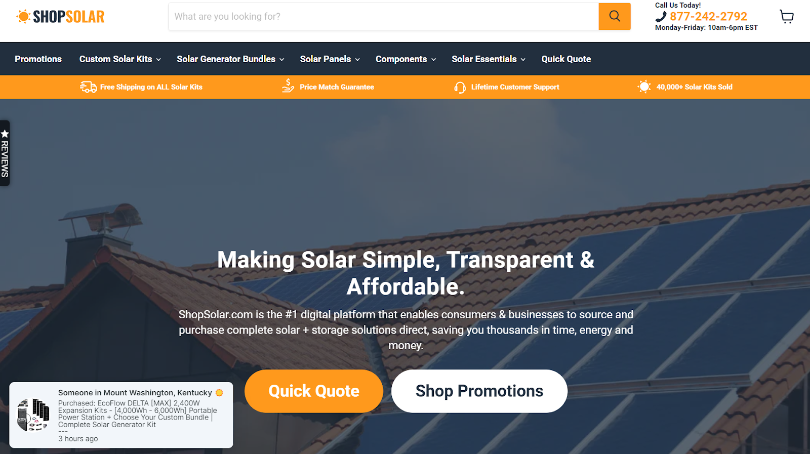
Source: shopsolarkits.com
By incorporating these elements into your web design, you turn your website into a beacon of trust, directly addressing one of the key reasons behind buyer hesitation.
2. Optimize Your Site for Speed
The speed of your website is more than a technical metric. It’s a crucial factor in capturing and retaining customer interest. Slow load times not only annoy visitors but put a significant barrier to sales.
Research consistently shows that website performance directly affects conversion rates. A study by Google shows that as the page load time goes from one to three seconds, the probability of bounce increases by 32%.
This means that a delay of just a few seconds can cost you a substantial portion of potential sales. Customers expect quick, seamless experiences, and if your site doesn’t deliver, they’re likely to go elsewhere.
Here are some best practices to make your web pages load faster:
- Compress images
Large image files can significantly slow down your website. Use compression tools to reduce file sizes without sacrificing quality. - Use Scalable Vector Graphic
To present your pieces of information more engagingly. An online SVG converter tool to convert images easily into SVG format. - Minimize HTTP requests
Each element on a page (like scripts, stylesheets, and images) requires an HTTP request to load. Reduce their number to speed things up.
- Use a content delivery network (CDN)
CDNs distribute your content across multiple servers worldwide, reducing the distance data travels to reach users, thus improving site speed.
- Optimize for mobile
Mobile users often have slower connections, making speed optimization even more crucial for mobile sites.
- Leverage browser caching
Browser caching stores website resources on computers, reducing load times for repeat visitors.
To dive deeper into website speed optimization, check out these resources:
- Google’s PageSpeed Insights – analyze your website and get specific recommendations for improvement.
- GTmetrix – a tool that provides insights on how well your site loads and offers actionable recommendations.
- WebPageTest – test your website’s performance across different browsers and countries.
3. A/B Test CTA Button Labels
CTA buttons are the gateways to customer conversion on your website. However, not all CTAs are created equal. The language you use can significantly impact a visitor’s decision to engage.
Why does this matter? CTAs that come across as too aggressive or transactional can deter potential customers. Words like “Subscribe” or “Buy Now” might imply a commitment that some visitors aren’t ready to make, leading to hesitation.
On the other hand, CTAs with a softer, more inviting tone can encourage engagement without applying undue pressure.
Here, A/B testing different CTA labels is a key optimization tactic. It can help you find the right balance between urgency and ease, ensuring that your CTAs are both compelling and comforting.
To capitalize on this strategy:
- Don’t settle on the first CTA label you think of. Instead, experiment with different wordings to see what resonates best with your audience.
- Use web analytics tools to track the performance of different CTA versions. Look for higher click-through and conversion rates to identify the most effective labels.
- Consider the emotional response your CTA wording elicits. Aim for a balance that encourages action without feeling too pushy.
For example, Aura, an Amazon repricer software, opts for a CTA label that reads Begin Trial instead of more transactional alternatives like Order Now or Purchase. Begin Trial suggests a no-pressure start, an invitation to explore without immediate commitment.
This approach is particularly effective for software offerings, where users might be hesitant to commit without trying the product first.
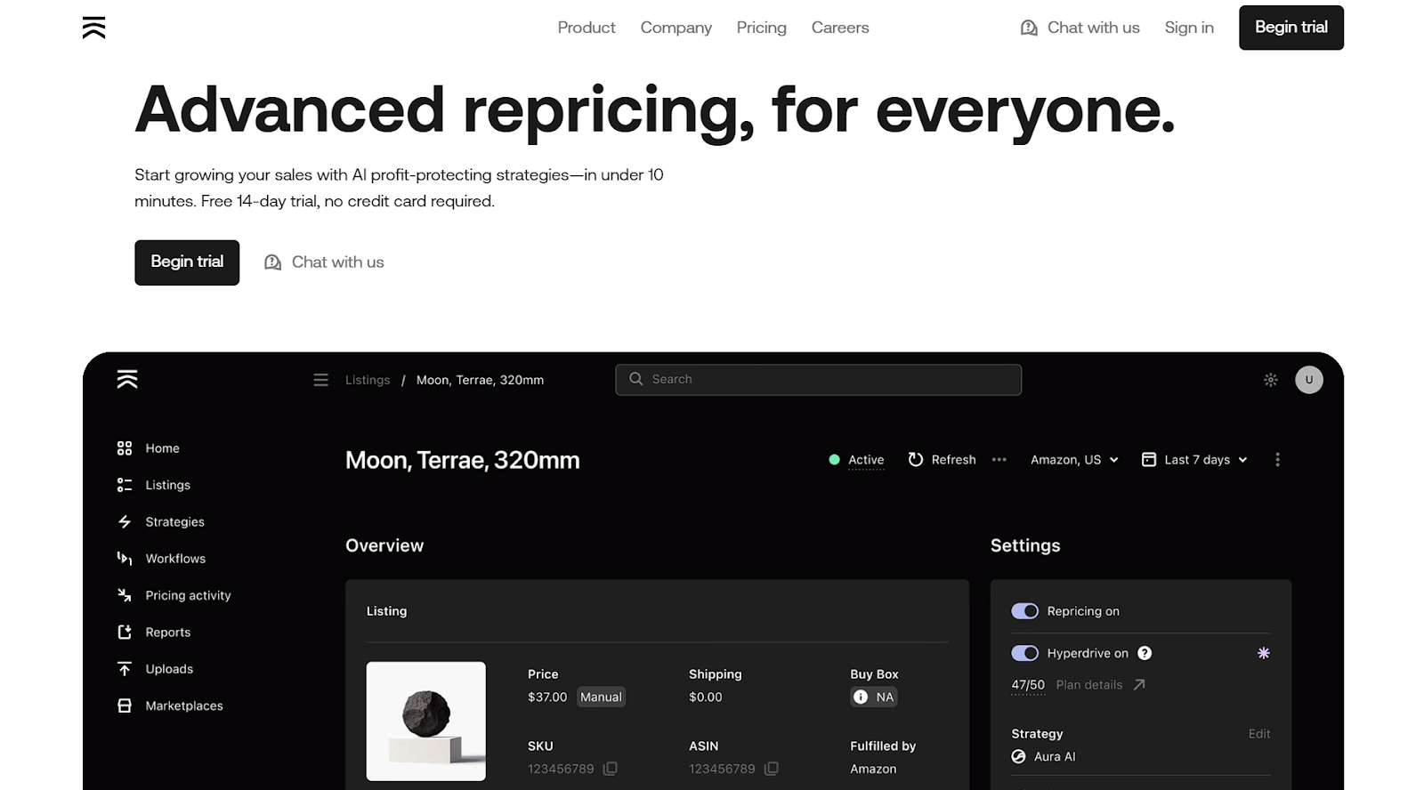
Source: goaura.com
4. Design Your Site for Mobile Users
In an era where smartphones are predominant, designing your website with mobile users in mind isn’t just a nice-to-have – it’s a necessity. A poor mobile user experience (UX) can be a major deterrent for potential customers, significantly affecting conversion rates.
According to a report by Statista, over half of all web traffic comes from mobile devices. Users expect a seamless experience on their phones, and if they encounter a site that’s hard to navigate or slow to load, they’re likely to abandon it.
Optimizing for mobile involves a few key principles:
- Responsive design
Ensure your site adjusts smoothly to different screen sizes and orientations.
- Simplified navigation
Have a clean, easy-to-use navigation menu. Think about the path a user takes through your mobile site and optimize for a smooth journey from landing to conversion.
- Fast load times
Implement the best practices for speeding up your website described above. Also, avoid overloading it with heavy graphics or complex layouts.
- Clear CTAs
Make sure your CTA buttons are prominently displayed and easy to tap.
- Readable content
Use fonts and sizes that are easy to read on small screens, and break up text into manageable chunks.
A stellar example of mobile UX done right is Lanteria, an HR management platform. Their mobile website is a testament to excellent mobile design. It features a clear, uncluttered interface, with messaging that’s direct and easy to understand. They also have their CTAs prominently placed, ensuring they’re easily accessible for users on the go.

Source: lanteria.com
This design approach respects the user’s need for quick, easy-to-digest information and seamless navigation – crucial elements in a mobile-first world.
5. Feature Trust Badges to Highlight Product Reliability
Trust badges are potent symbols of credibility and safety. They play a critical role in reassuring customers about the reliability and security of your products and website.
Unlike text, which requires reading and interpretation, badges offer instant recognition and assurance. They act as visual cues that quickly communicate security, quality, and authenticity. This immediate visual confirmation is often more powerful than a block of text, as it taps into the user’s inherent trust in recognized symbols of safety and quality.
Integrating trust badges is a strategic web design decision. Here are some best practices:
- Position trust badges near CTAs, pricing, or checkout buttons where users make critical decisions. Choose those that align with your product’s strengths and your customer’s concerns.
- Ensure the badges complement your website’s design. They should also stand out without disrupting the overall aesthetic.
- Use badges that are relevant to your industry and recognized by your target audience.
- While it’s tempting to feature multiple badges, too many can overwhelm the user and dilute their impact. Choose the most impactful ones.
Transparent Labs, a brand specializing in natural sports nutrition supplements, effectively uses trust badges on their whey protein isolate product page. Their approach includes placing the trust badges where users are likely to look when considering a purchase.
Also, they feature badges that resonate with their audience, like “Non-GMO,” “No artificial sweeteners,” or “Gluten-free,” which directly address common concerns in the supplements industry.
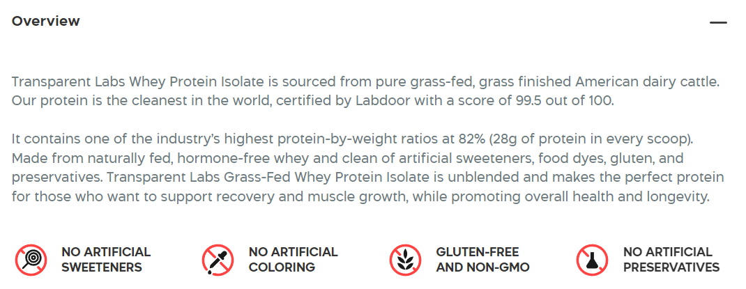
Source: transparentlabs.com
6. Be Very Clear About Customer Value
Succinctly conveying to potential customers why they should choose your product or service over others is vital. A strong value proposition is more than a catchy phrase. It’s a crystallized statement of the unique benefits and solutions you offer.
A well-articulated value proposition addresses customer needs and pain points, making it immediately apparent why your offer is the best choice. This clarity helps in reducing hesitation and propels visitors toward conversion.
Effectively showcasing your value proposition involves:
- Increasing visibility
Place your value proposition prominently on your website, ideally on the homepage and at every crucial decision-making point.
- Using brevity and clarity
Communicate your value proposition in as few words as possible, ensuring it’s easy to understand at a glance.
- Addressing pain points
Tailor your value proposition to directly address the primary concerns or needs of your target audience.
Going, which provides affordable flights, excels in brevity. Their value proposition is clear and to the point, immediately informing visitors of the primary benefit: cheap flights from anywhere. This simplicity and clarity remove any guesswork for the user and highlight the core value instantly.
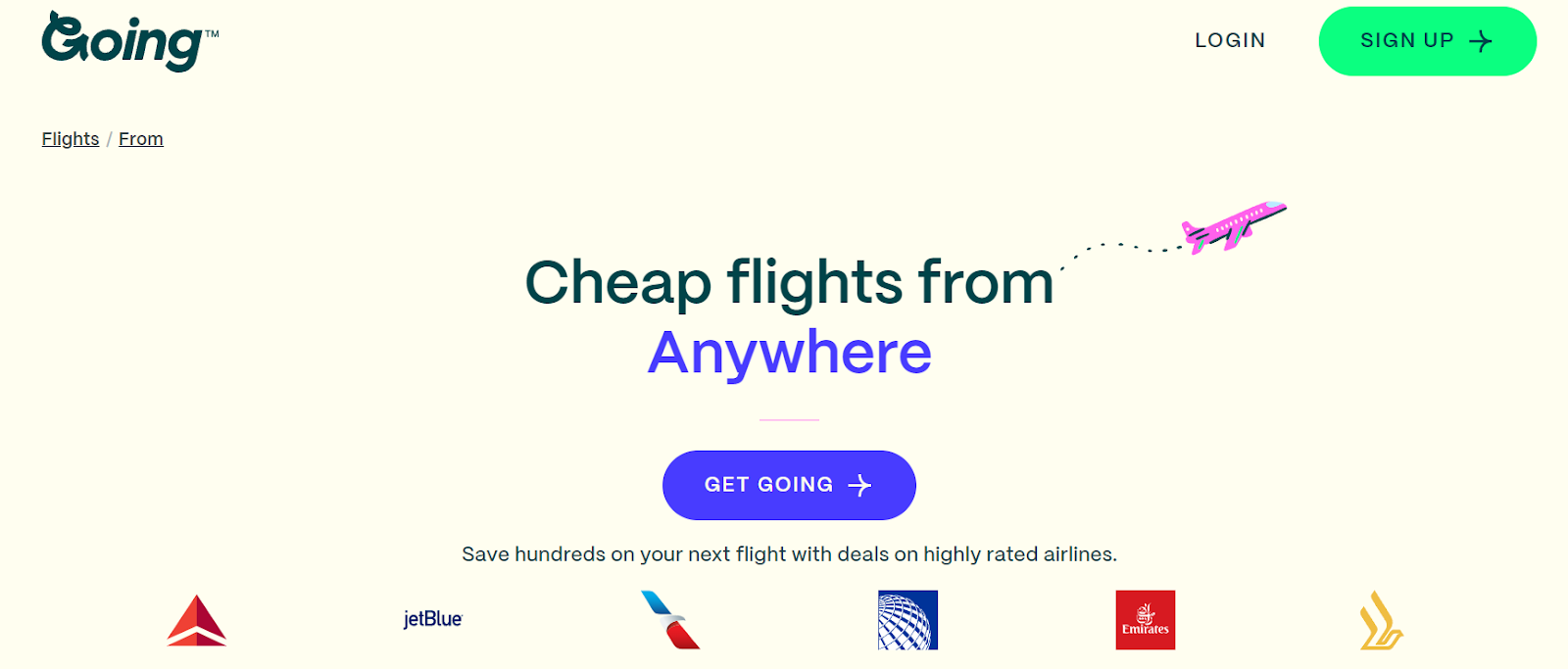
Source: going.com
HelloFresh takes a different approach. This meal kit delivery service has a value proposition that focuses on solving a specific problem: the hassle of meal planning. By stating that they take the stress out of deciding what to cook, HelloFresh speaks directly to a common pain point of their target audience. This relevance makes their offer instantly attractive to potential customers who face this issue.
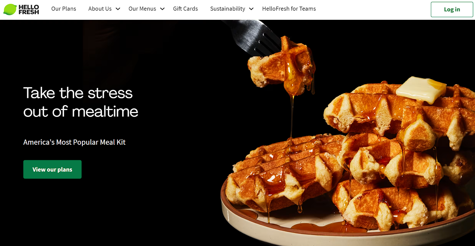
Source: hellofresh.com
7. Show Your Product In Action
Since customers can’t physically interact with products online, showing your product in action is a game-changer. Videos or animations not only capture attention but also help potential buyers visualize the product’s use and effectiveness. This strategy bridges the gap between online browsing and real-world experience.
It works perfectly because, for online shoppers, seeing is believing. A product demonstration, whether through video or animation, provides a much clearer understanding of what the product does and how it works as compared to text or image. Explainer videos can be particularly impactful for products whose benefits aren’t immediately obvious from images or descriptions alone.
Here’s how to incorporate product demonstrations:
- Place them strategically.
Feature videos or animations where they’re most likely to influence purchasing decisions, such as on product pages or in landing page content.
- Ensure quality and clarity.
Provide high-quality visuals and effectively demonstrate the product in a clear, understandable manner.
- Keep them relevant and concise.
Ensure that your demonstrations are directly related to the product’s key features and benefits, and keep them short enough to maintain viewer interest.
- Optimize for load times.
While rich media such as videos are engaging, they must be optimized to ensure they don’t slow down your website.
Mouldd, a resin seller, effectively uses this strategy on their deep pour epoxy resin kit product page. They feature a simple yet informative animation showing the resin in use. This demonstration achieves several things:
- It clarifies the product’s function.
The animation provides a clear understanding of how the resin is mixed and applied.
- It engages the viewer.
The visual element grabs attention and keeps the viewer engaged, increasing the likelihood of conversion.
- It builds confidence.
By seeing the product in action, potential buyers feel more confident about how it works and its results.

Source: mouldd.co.uk
8. Simplify Your Checkout Process
The checkout process is the final hurdle in the customer’s journey on your website, and its complexity can make or break a sale. Simplifying this process is crucial, as a cumbersome or lengthy checkout can lead to cart abandonment and lost sales.
According to a report by Baymard Institute, over 70% of shopping carts are abandoned, and a significant reason for this is a complicated checkout process. Providing a straightforward, intuitive checkout experience can greatly reduce this rate, directly impacting conversion rates.
To simplify the checkout process:
- Reduce the steps to get there.
Minimize the number of steps required to complete a purchase.
- Provide a guest checkout option.
Allow customers to checkout without creating an account, removing a significant barrier to purchase.
- Ensure clear navigation and instructions.
Clearly mark each step and make the instructions easy to understand. Also, remove unnecessary steps or information fields.
- Optimize the form fields.
Only ask for essential information, and use auto-fill where possible to speed up the process.
- Focus on user-friendly design.
Ensure that the checkout page is intuitively designed, with a clear path to completion.
ASOS, an online fashion and cosmetic retailer, exemplifies an efficient checkout process. Their approach includes:
- Guest checkout
ASOS offers a guest checkout option, allowing customers to make purchases without the need for account creation.
- Simplified steps
The steps in the checkout process are concise and clearly marked, reducing confusion and saving time.
- Intuitive design
The checkout page is designed for ease of use, with a clean layout and visible instructions.
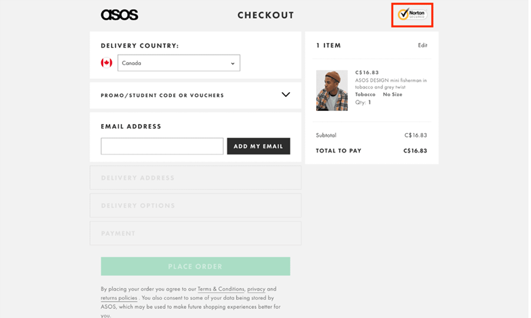
Source: asos.com
Final Thoughts
In the journey of optimizing your website to overcome buyer hesitation, we’ve navigated through eight powerful strategies. Each of them serves a unique purpose in enhancing the user experience and building customer trust.
As you apply these strategies, keep in mind that website optimization is an ongoing process. Regular testing, analysis, and adaptation are super important. Stay attuned to your customers’ needs and feedback, and be ready to evolve your strategies accordingly.