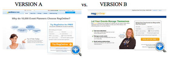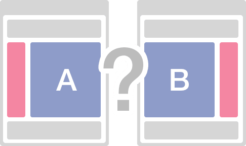
An A/B Test is a strategy in marketing where two versions A and B, are tested against each other. Half of viewers see one version and half the other. Both are sent to the same destination page where an action is required.
This is done to learn from real behaviors which versions does better at getting visitors to do what you want. An A/B Test is used for webpages, landing pages, marketing emails, and ads.
Need examples? Here are 10 A/B Test case studies and their convincing results.
#1. ADEXPRESSO

AdExpresso, an optimizer for Facebook ads, used different copy in this A/B Test. Copy in Version A said you get “pro tips” versus “daily tips” in Version B which also mentioned “increase your ROI.” After a few days, Version A drove over 70 new Likes while Version B drove 0. Very quickly, this A/B Test isolated the message that was more appealing.
#2. BARACK OBAMA
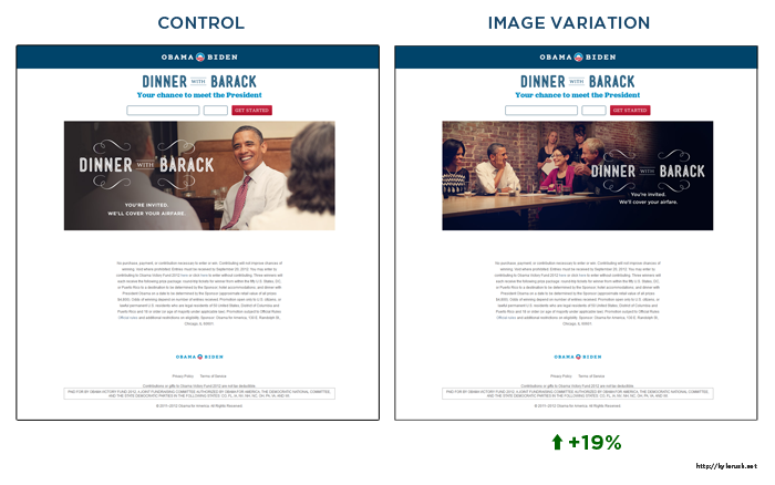
Even the President has done an A/B Test. In this test, the objective was to see if a shot of the President or a photo with the First Lady and two dinner guests would be more likely to convert. The thinking was if people could see just how close they would be sitting to the President, this would increase their interest. The photo on the right lifted conversions by 19%.
#3. BLIVAKKER
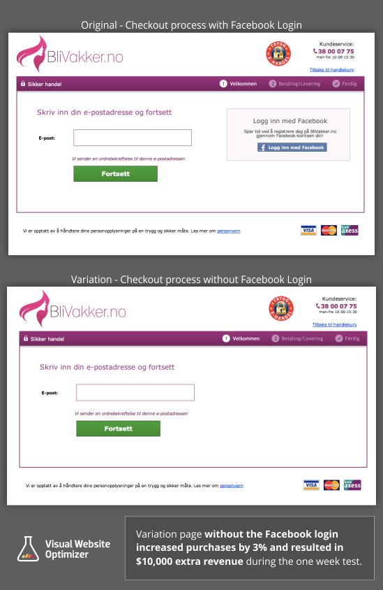
BliVakker is one of Norway’s leading online cosmetics retailers with about 20,000 visits per day. A developer pointed out that the Facebook login was adding significant complexity to their internal systems and processes. So was it really worth it? The login page without the Facebook Connect increased conversions by 3%, which at Blivakker’s scale translates to about $10,000 in extra sales each week.
#4: BODY ECOLOGY
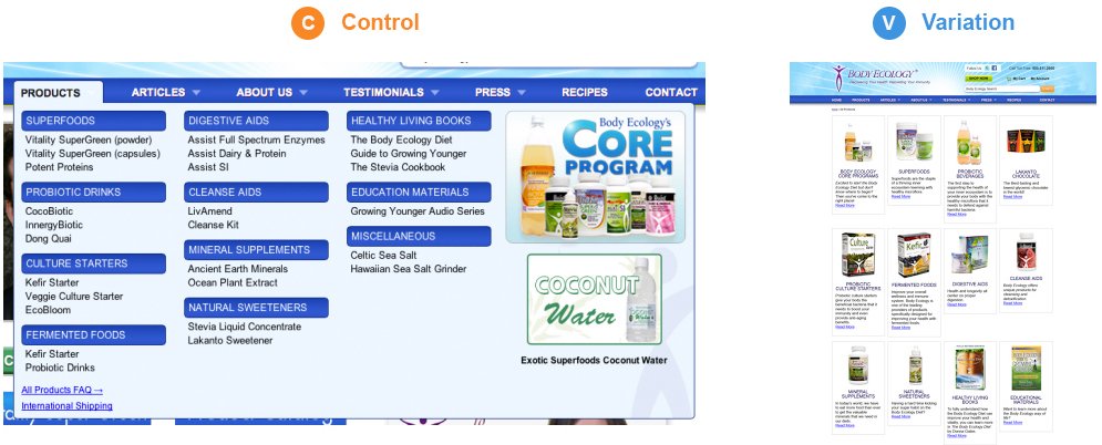
An eCommerce store offering health-related products, ran an A/B Test where they eliminated their drop-down menu for products on the homepage. They thought that presenting a product category page in place of a drop-down menu would improve sales. They were right. When they removed the drop-down menu for products, revenue soared by 56% in just two weeks.
#5. CALIFORNIA CLOSETS
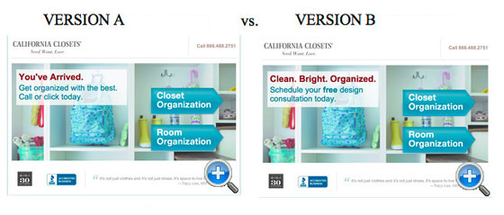
In this A/B Test, Version B looked as if it should be better: the headline copy was snappier, the sub-head clearer, but instead Version A increased leads by 115%. Why? Simply because the copy in Version A was designed to tie in with and complement the PPC ads that drives users to the next page. The lesson was the sales funnel consists of many elements, making them work together increases their effectiveness.
#6. COMSCORE
ComScore, a cross-platform measurement company, ran an A/B Test for their product pages. Their original product pages displayed the minimum viable product for social proof: a customer quote. They experimented with different designs and orientations, plus the addition of a customer logo, to see if a different visual treatment would make their social proof convert more visitors into leads. Using a vertical layout with the client logo displayed prominently on top of the testimonial in Variation 1 increased the conversion rate of the product pages by 69% compared to the original.
#7. HUBSPOT
It might too minor to make a difference, but HubSpot, an inbound marketing and content marketing company, found that changing the CTA button color on a landing page from green to red increased clicks by 21%. Red may connote warning or stop but it is also known to be eye-catching. Red, in general, is not used as a button color nearly as often as green. And the 21% difference was huge.
#8. MEDEINREICH
MedeinReich, an online computer training company, ran a A/B Test of the service offering on their homepage. Their hypothesis was by replacing ‘course categories’ with ‘best selling courses’ on the homepage they would boost engagement. They found that introducing their hottest-selling services on their home page boosted engagement by 41% in just 20 days.
#9. PAPERSTONE
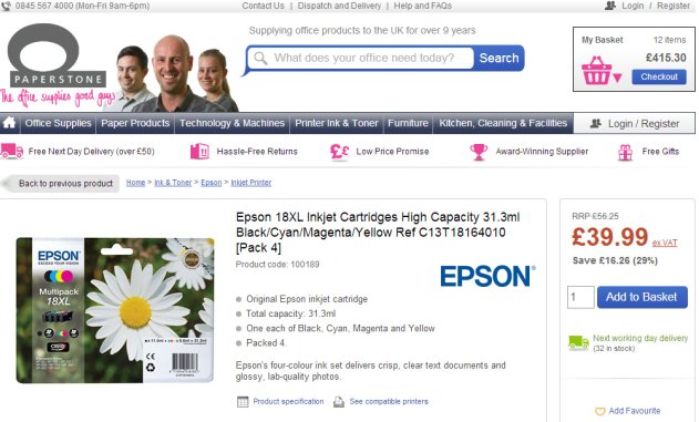
PaperStone deals in office supplies. They found out that if they display competitors’s higher prices for specific products made conversions jump. They showed competitors higher prices on product pages to increase clicks on ‘Add To Basket’ and their overall website conversion rate. It worked. Conversion Rate jumped +10% on this A/B Test of 12,000 visitors over 2 weeks.
#7. REGONLINE
A good landing page communicates information quickly and efficiently. That’s what RegOnline, a software solution for events, proved. It used good copy and also good typography to achieve this. Version B did this much better than Version A. It had three bullet points, each reinforced with a tick, as opposed to words in speech bubbles. The removal of the tabbed navigation also helped Version B. It achieved a +89.9 lift in free account sign-ups versus Version A.
Do these case studies convince you of the results your business could be seeing with an A/B Test? Do you need a partner to help create and measure A/B Tests?

