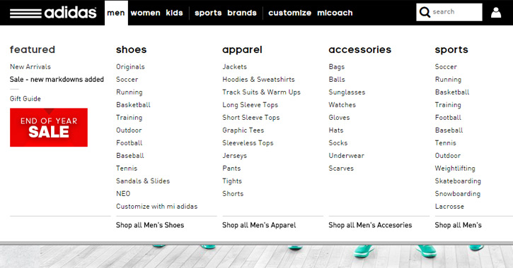
Mega menus
Mega menus are drop-down interfaces triggered by the user hovering over a link or defined area. This dropdown usually shows all options in one main, mega-panel and oftentimes groups related topics into categories.
Mega menus make it possible to show viewers everything available in a specific category and can include images. This makes it easier and faster for an interested visitor to get where they want to go, improving User Experience (UX).
Google algorithms are designed to get to know your website and serve the most relevant content. So, mega menus can also benefit Search Engine Optimization (SEO).
But they are not right for every business. Groupings should be done according to business goals. And implementation requires development skills. Here are 7 advantages and disadvantages of mega menus.
7 advantages
- MORE TRANSACTIONS: As the image above shows, mega menus have the greatest use among e-commerce retailers. That’s because they provide a broad snapshot of what’s available with itemized detail to quickly take the visitor to their area of interest
- MORE LEADS: If you are a B2B business, you can improve lead generation and SEO by listing articles in your mega menu. This can be a highly effective way to take viewers to key information and actions.
- GROUP LARGE AMOUNT OF CONTENT: Mega menus assist with SEO rankings by way of grouping subpages and keywords, creating silos. Silo architecture, by definition, isolates groups of pages that are all relevant to the same keyword. It gives your site an extra layer of organization.
- IMAGES CAN BE ADDED: They are a good way to introduce images in navigation. This can show as well as tell what the menu item is about. And this can increase click-throughs and conversions.
- MOUSEOVER VS. CLICK: The interface works upon mouseover. They usually span several columns and are a good way to streamline content and images.
- MORE EFFECTIVE THAN LARGE DROP-DOWN MENUS: Jakob Nielsen and Angie Li did a study showing that for large navigation menus. Mega menus enhanced UX compared to drop-down menus. This is because a drop-down menu with lots of content will require the user to scroll down or sometimes scroll down and then back up again. This takes longer, puts more strain on short-term memory, and can be confusing.
- UPDATABLE: For a news site, content aggregator or business that frequently announces new offerings, mega menus can and should be updated regularly. This type of dynamic function can have advantages for SEO and UX.
7 disadvantages
- NOT MOBILE-FRIENDLY: Mega menus are not practical for mobile display. If a company has even a modest percentage of mobile site traffic, it will need to devise a separate navigational structure for mobile display, which creates all sorts of design and development challenges.
- TOO MANY LINKS: As mega menus work through mouseover with links, they end up putting lots of links at the top of the page. Google itself says in its Webmaster Guidelines that webmasters should “Keep the links on a given page to a reasonable number.” Google’s official Search Engine Optimization Starter Guide (PDF) recommends that webmasters should avoid “creating complex webs of navigation links.
- DON’T LINK TO A MEGA PAGE: Do not ever include a link within your mega menus (or anywhere, for that matter) to a page that just lists everything on a single page, like a mammoth sitemap page. That flattens out your site hierarchy and removes your ability to “spotlight” or prioritize.
- SLOW PAGE LOADING SPEED: A massive collection of links in the navigation will slow load times and rendering. Maybe, not as much as a large image or video, but this is a factor to consider.
- DUPLICATE CONTENT: The implementation of mega menus can result is a huge markup to the site navigation. Content from other pages is often transferred through the coding causing duplicate content. Google discredits duplicate content for SEO. For UX, it makes it harder for search engines to send viewers to the most relevant page. Google’s official definition of duplicate content: “Duplicate content generally refers to substantive blocks of content within or across domains that either completely matches other content or are appreciably similar.”
- OVERKILL FOR SITES WITH LIMITED CONTENT: If your site doesn’t have a lot of content, they are going to be overkill. This would include sites with a limited number of pages, blogs with a singular focus and websites that provide tools and calculators.
- SCREEN SIZE AND READABILITY: While the advantage of grouping large amounts of content can be an advantage, it can be a disadvantage if items on the menu are too small to read.
The takeaway is mega menus, whether advantages or disadvantages, should be evaluated based on business goals. And the resources available to properly, implement, update and measure their impact and improvement.
Does this help you understand mega menus and the appropriateness of your business?

