- 50 million mobile apps are downloaded every day (Nuance)
- 90% of all downloaded mobile apps are used once and then deleted by users (Digital Trends)
- Only 16% of people will try out an app more than twice (Digital Trends)
If there ever was a place where the phrase, you never get a second chance to make a first impression, applies, it would be mobile apps.
Growth trends show no end in sight for mobile apps downloads, but, unfortunately, very few stick and usage is another matter.
How to make great mobile apps? Here are 8 great examples and why they succeed.
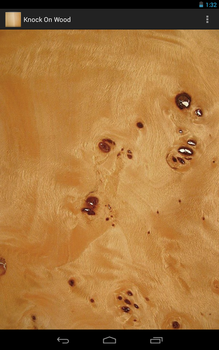
#1. SUCCEED ON EITHER FUNCTION OR FUN. (KNOCK ON WOOD). Successful apps either to solve a problem or entertain you. For example, are you Superstitious? Then get Knock on Wood, the app that provides a virtual piece of wood so you can avoid tempting fate or bring good luck by knocking on wood even when there isn’t a real piece of wood to hand. It’s a simple solution that provides function every one of us has undertaken that’s also fun.
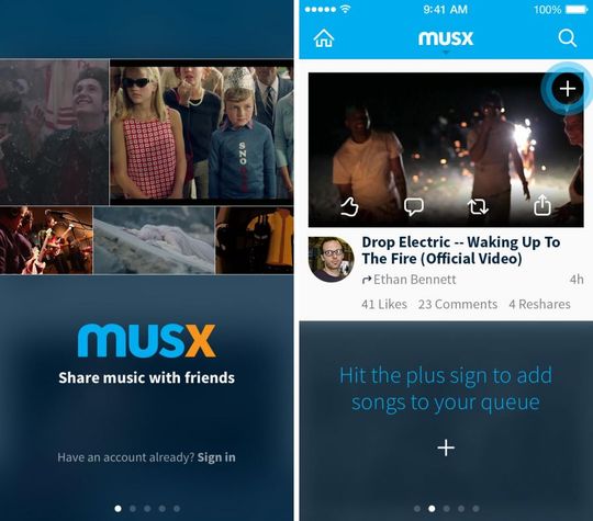
#2. KNOW YOUR AUDIENCE (MUSX): A great app does one thing well to demonstrate it understands its audience and is designed for them. Musx is focused on those who want to share and discover new music. While the app may appeal to more casual music listeners, features like tagging a song or mentioning a friend are geared towards those who believe music is social.
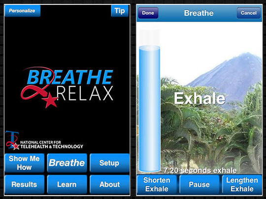
#3. KEEP IT SIMPLE (BREATHE2RELAX): The best apps have just one or two main functions and do them well. Breathe2Relax is a portable stress management tool. Breathe2Relax is a hands-on diaphragmatic breathing exercise. Breathing exercises have been documented to decrease the body’s ‘fight-or-flight’ (stress) response. Capitalizing on touch-screen technology, a user can record their stress level on a ‘visual analogue scale’ by simply swiping a small bar to the left or to the right.
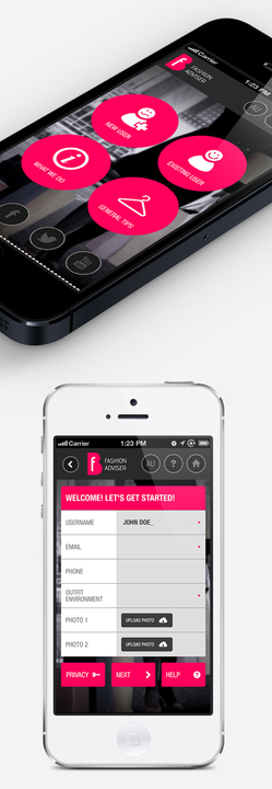
#4. USE MINIMAL TEXT (FASHION ADVISER): If your main feature is a document, then users would probably prefer to read it online instead of going to an app store, downloading the app, reading the app on a small screen, and then deleting the app. So keep text minimal. For example, instead of delivering a document on fashion tips, Fashion Adviser provides designer tips on fashion advice like how various shades of grey work alongside hot pink with a minimum of words and visual comparisons, showing rather than telling.
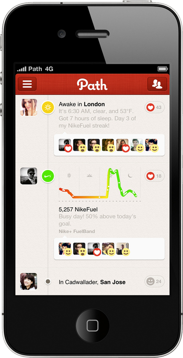
#5. HAVE A CAPTIVATING INTERFACE (PATH): Whenever the user opens an app, he or she forms an impression; it can be good or bad. In case of free apps, if the app doesn’t look good and the navigation is not smooth, then there is a huge chance the user won’t open it next time. How to overcome this problem? Take Path, a social network that limits the number of friends each user can have to 50. Its focus is on sharing photos with a close network of friends. Path realizes that users can see only one screen at a time and makes an excellent use of categories to separate content. Path has achieved success because it not only looks good, it also has the features smartly organized so users never get bored.
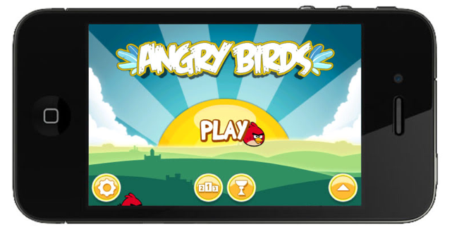
#6. MAKE UPDATES REGULARLY AND MAKE THEM EASY (ANGRY BIRDS): Some developers hold a view that creating a wonderful app is enough, but the truth is far from it. Maintaining the app is real art and each and every user who has bought a paid version of any app looks ahead to explore and churn out maximum out of the application. Hence, if a developer wants users to stay loyal to the app, he or she should make enough arrangements for back-up support and should keep on adding new features. Angry Birds is by far the most successful gaming app being downloaded. The app got successful because not only it is a fantastic game to play, but it also updates the game regularly so that the customers don’t feel monotonous.
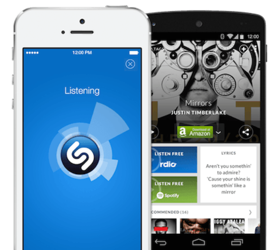
#7. DESIGN AND ORGANIZE FOR A SMALL SCREEN (SHAZAM): Mobile has enormous potential and many overlook the obvious, the screen is small and people’s fingers are big. For example Shazam; a music discovery application provides all the information about any song track that is being played on a device. Reason behind the huge success of Shazam is, it has minimal elements and the main feature of the app is displayed at the front and thus conveys an effective call to action.
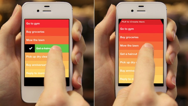
#8. MAKE MARKETING A PRIORITY (CLEAR): Just because you build it doesn’t mean your audience will come. Make sure you budget appropriately for app promotion. Divide your marketing plan into three phases: pre-launch campaign, launch campaign and post-launch campaign. Create banner images that will go up on your app store profile page. Use absolutely stunning screenshots of your app in the app store description. Write a fantastic app description and use the right keywords. Take for instance, Clear, which entered the hugely competitive market of to-do list apps. This app started to get tech blog coverage based on demos, previews and teaser videos even before it went to market. Within nine days of its launch, 350,000 copies sold.
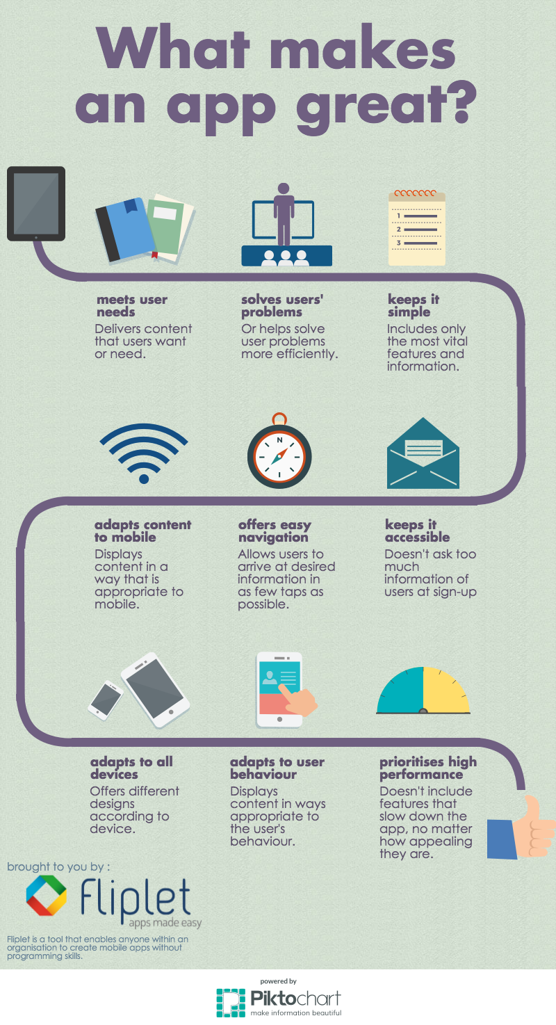
Below is an infographic as a visual reminder of what makes a mobile apps great.
Do these examples help you know what makes a mobile app great? Are you consider a mobile app for your business?


