Best data visualization tools drive better decision making. As Peter Drucker says, “what’s measured improves.” And the data backs up business leaders believe it.
- 91% of marketing leaders believe successful brands use customer data to drive business decisions.
- 87% of marketers agree capturing and sharing the right data is important to effectively measuring ROI in their own company
A simple pie chart you can one-click using Microsoft Excel is a best data visualization tool if it accomplishes this task. As technology has evolved, new kinds of data visualizations have emerged. Not only pie, line and bar charts but timelines, maps, heat maps and gauges using a whole host of new technologies and tools.
If you’re looking to really exploit best data visualization tools, you should be careful before making a buying decision. The costs of these tools vary widely. You could spend a lot of money before you know if you’re getting what you really need.
To use data to improve decision making without spending any money, here are the 10 best data visualization tools for free in 2018
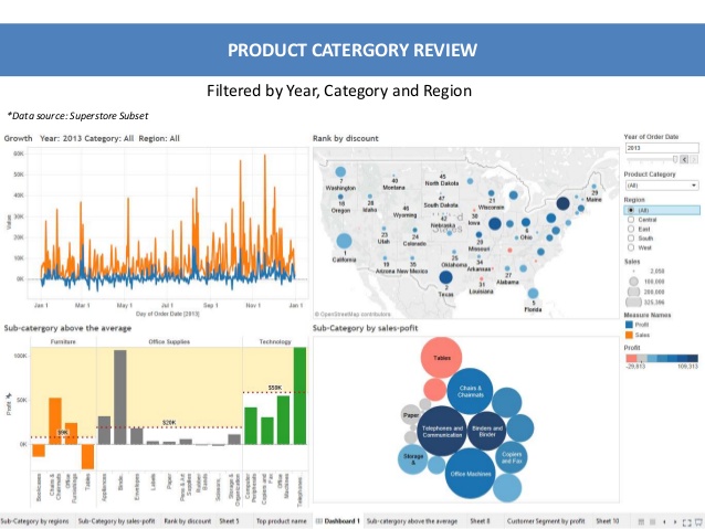
1. TABLEAU PUBLIC: This is the same platform as the paid version of Tableau Desktop with only one caveat: Everything you create with it is public, which means you’ll automatically be making it available on the web via Tableau’s visualization gallery. The company chose not to make its free version feature-poor. And Tableau Gallery is a great resource, not only for business people but also for researchers, students, and journalists looking for ways not just to flesh out and beautify their Other folks have done tremendous work on some truly impressive data visualizations and Tableau has curated that content and made it available for download.
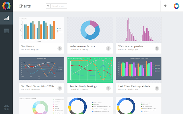
2. CHARTBLOCKS: Chartblocks, like many of these free programs, basically does the same thing that made Windows so successful: replace the code with a visual interface so anyone can use it. In Chartblocks’ case, that visual interface is their chart designer, which guides you through the process. With its free version, you can make up to 30 charts, export the charts as PNG files (no vector graphics in this version), and get up to 5,000 monthly views.
3. CHARTBUILDER: This best visualization tool has one of the cleanest user interfaces among all the charting tools I’ve seen. It’s extremely easy to use as well. All you have to do is upload a CSV file, or a Google Sheets link, and it’ll generate the chart for you. Moreover, it refreshes your chart every 30 minutes, so your chart’s data source remains fairly up-to-date. The Charted service is free, and its source code is also freely available if you would like to run it on your own web server.
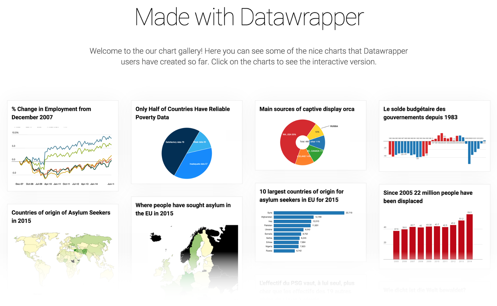
4. DATAWRAPPER: This is one of the extremely easy-to-use best data visualization tools for plotting interactive charts. All you need to do is upload your data via a CSV file, choose the chart you want to plot, and that’s basically it, you’re good to go! It’s a very popular tool among journalists, often using Datawrapper to embed live charts into their news articles. The fact that it’s a tool of choice for most of the non-techie people out there tells you how easy Datawrapper is to use. Read this tutorial to get started with Datawrapper.
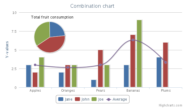
5. HIGHCHARTS: Highcharts, another big name in the data visualization domain, offers you a wide selection of charts and maps. They offer many plugins that allow you to experience all of its powerful features without needing to deal with JavaScript. Highcharts is free for non-commercial purposes.
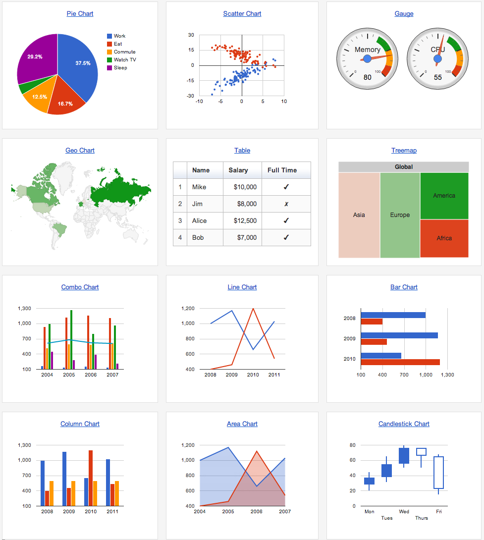
6. GOOGLE CHARTS: Google Charts is user-friendly and compatible with all browsers and platforms. It covers a wide range of data visualization types — from simple line and bar graphs to complex hierarchical tree maps — making Google charts suitable for almost any project. Check out the gallery that showcases the various charts and visualizations that Google Charts offers.
7. MYHEATMAPS: If you want your visualization to provide immediate recognition, a heat map is a good way to go. Heat maps’ use of color makes them intuitive. MyHeatMap has the same easy user experience as a lot of other free software: drag, drop, (et voilà!) map. Be sure that at least two of the rows are for latitude and longitude, and that these values are included for all the data points you want to map. The one downside is a lack of privacy. MyHeatMap’s free version only offers public maps, and those free maps only get 20 data points for each.
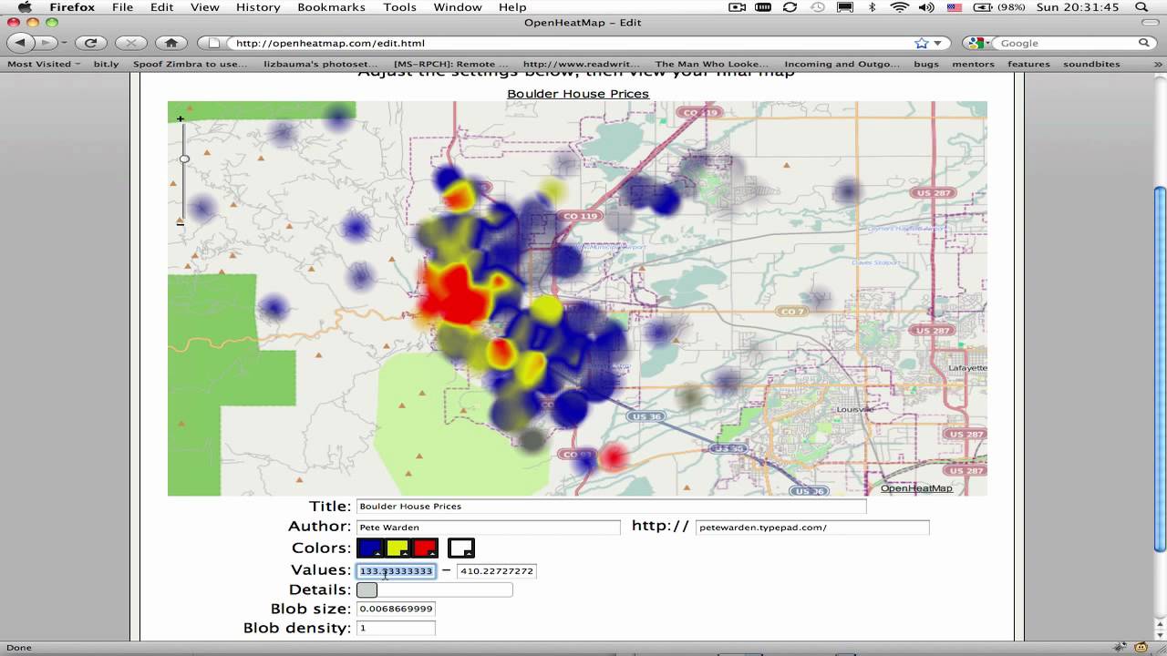
8. OPENHEATMAPS: Creating a map is simple. You upload a CSV, Excel, or Google Sheets file to owner Pete Warden’s heat map website, click a button and get a map. It’ll live on his site, but you can link to it. This is all to say that Openheatmap is about as simple as sending an email with an attachment.
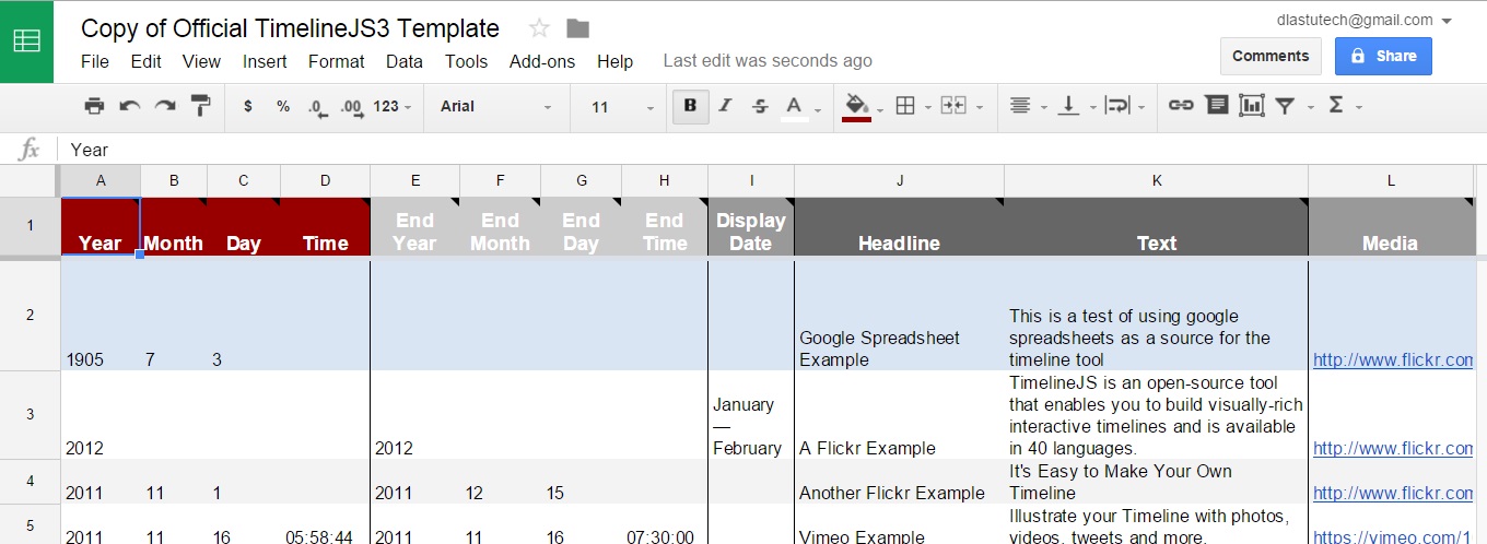
9. TIMELINE: Timelines are to history what directions are on maps: they show how one thing led to another. Timelines can also be a great way to enliven reports, especially when a tool like Timeline allows you to design and embed them for free. If you’ve got a Google Drive account, just make a Google Spreadsheet using a template Timeline provides, embed it on your website.
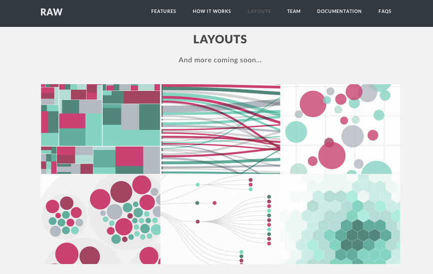
10. RAW: Raw bridges the gap between spreadsheets and vector graphics. It’s built on the D3.js platform. If you’re not a programmer, Raw could be the perfect data visualization tool for you. Raw provides a selection of 16 ready-to-use chart types. Customization is one of the biggest positive aspects of Raw, for it allows you to use your own custom layouts.
Do these best data visualization tools give you an idea of one for your business? Are you glad these best data visualization tools are free? Does your business need help with data visualization?

