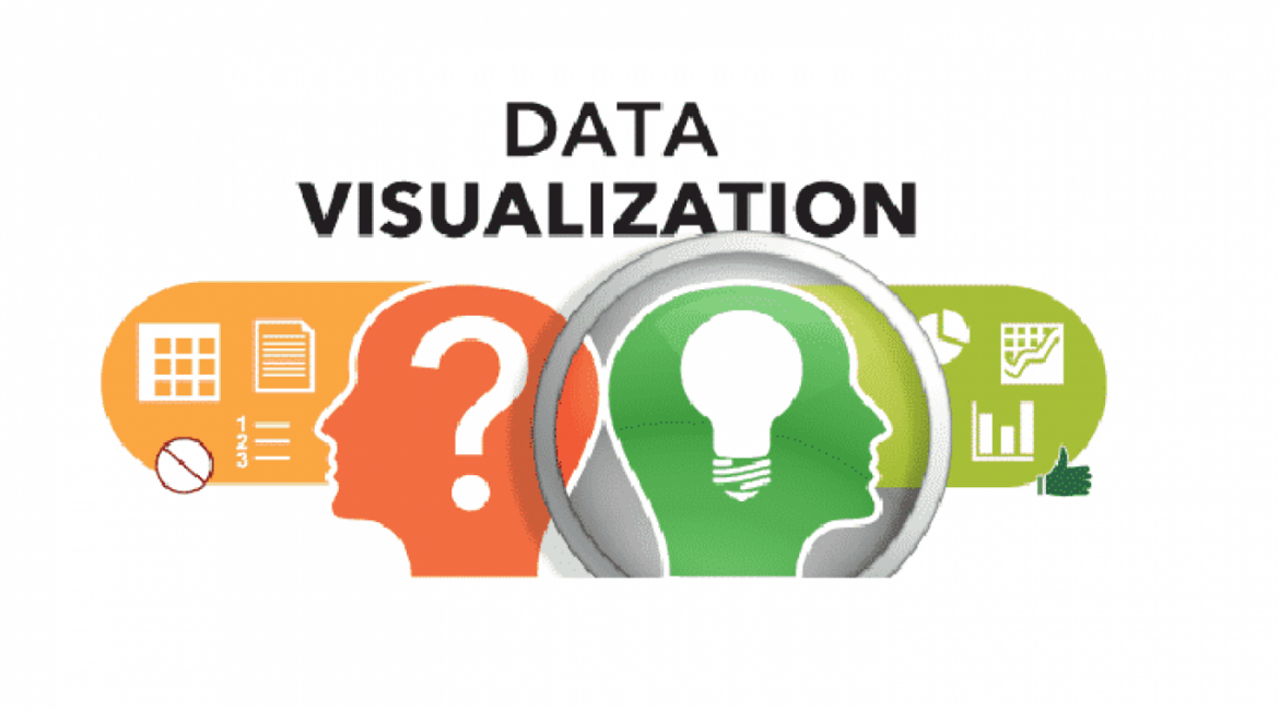
Data Visualization Tips
Data visualization tips help you tell a story with a chart, graph, diagram, or picture. And guide you with the best representation for your data on the point you want to make.
Here are 10 data visualization tips to choose the best type of chart for your data.
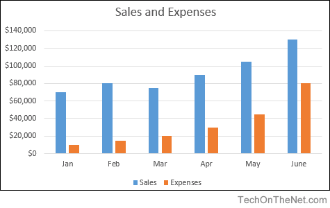
Column Chart
Column charts are a good way to show change over time because it’s easy to compare column lengths. Like bar charts, column charts can be used to plot both nominal data and ordinal data, and they can be used instead of a pie chart to plot data with a part-to-whole relationship. Data visualization tips on column charts are they work best where data points are limited (i.e. 12 months, 4 quarters, etc.). With more data points, you can switch to a line graph. The above chart is an effective use of a column chart to show a company’s year-to-date profitability by plotting monthly sales against expenses,
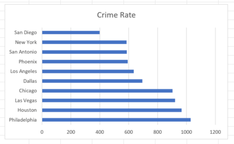
Bar Chart
Bar charts are used to compare things between different groups or to track changes over time. However, when trying to measure change over time, bar graphs are best when the changes are larger. A bar chart is a particularly telling way to display data when there is a group that has a half-dozen of more entries. Like the above bar chart that shows the crime rate in various U.S. cities.
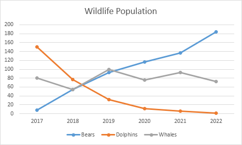
Line Chart Data Visualization Tips
Line charts are best when you want to show how the value of something changes over time, or compare how several things change over time relative to each other. If you are looking to show change “over time” or a “trend,” that’s your clue to use a line chart for your data. Line charts are common and effective charts because they are simple, easy to understand, and efficient. Line charts are great for 1) comparing lots of data all at once, 2) showing changes and trends over time, 3) including important context and annotation, and 4) displaying forecast data and uncertainty. Like the line chart in the example for specific types of wildlife.
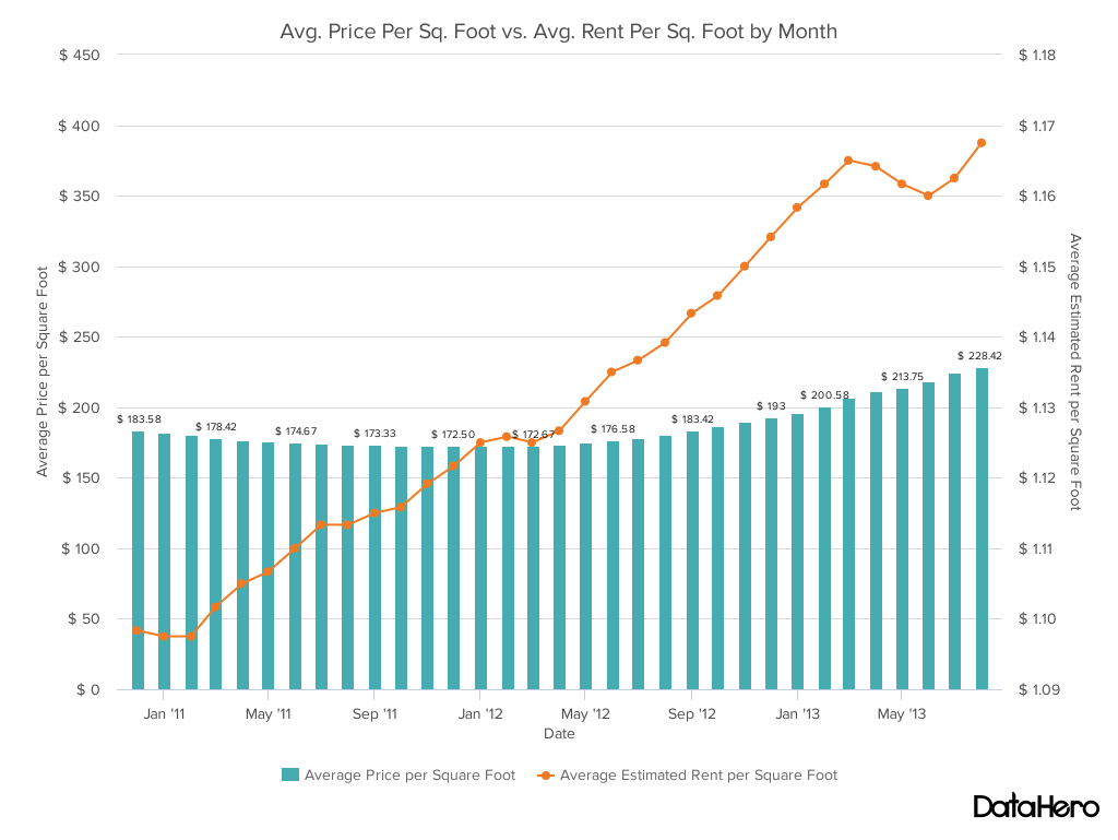
Dual Axis Chart
A dual axis chart is a great way to easily illustrate the relationship between two different variables. They illustrate a lot of information with limited space and allow you to discover trends you may have otherwise missed if you’re switching between graphs. You can display two numerical values with different units with a dual axis chart as well. Data visualization tips are don’t overwhelm a dual axis chart with too much data. Keep it simple to the story you want the data to tell. Like the above chart that shows the trend in square footage prices for homes versus rentals in California.
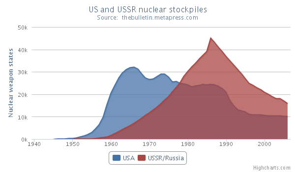
Area Chart
An area chart displays graphically quantitative data. It is based on the line chart. The area between axis and line is commonly emphasized with colors, textures, and hatchings. Commonly one compares two or more quantities with an area chart. Because an area chart has a stronger visual emphasis than a line chart, it is best to use an area chart when there are fewer data comparisons. Like the comparison of U.S. versus Russian nuclear stockpile over time shown above.
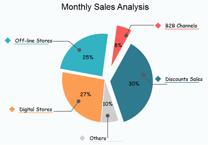
Pie Chart Data Visualization Tips
Pie charts are generally used to show percentage or proportional data and usually, the percentage represented by each category is provided next to the corresponding slice of pie. Pie charts are good for displaying data for around 6 categories or fewer. A pie chart is best used when trying to work out the composition of something. If you have categorical data then using a pie chart would work really well as each slice can represent a different category. Like the above example.
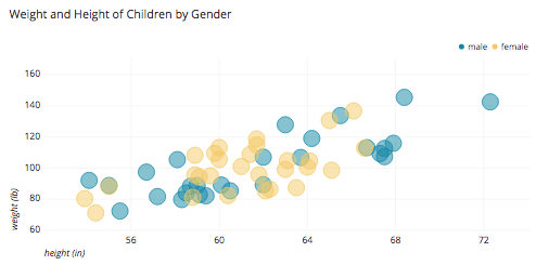
Scatter Chart
A scatter chart works best when comparing large numbers of data points without regard to time. This is a very powerful type of chart and good when you are trying to show the relationship between two variables (x and y-axis). The type of data used in this chart is generally statistical or scientific. And can suggest various kinds of correlation between the variables. In this type of chart, the closer the plotted points are to making a straight line the stronger the relationship is between the two variables. Like the above correlation between height and weight in a broad range of children.
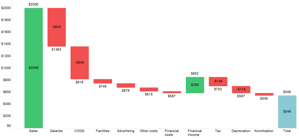
Waterfall Chart
A waterfall chart shows a running total as values are added or subtracted. It is especially useful for understanding or explaining the gradual transition in the quantitative value of an entity. Data visualization tips on a waterfall chart are they are often used to show changes in revenue or profit between two time periods. Like the above chart that illustrates how different factors contribute to a final result.
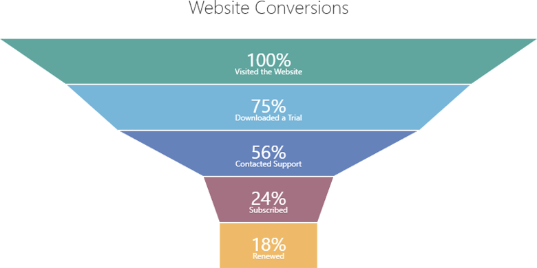
Funnel Chart Data Visualization Tips
The Funnel chart is used to visualize the progressive reduction of data as it passes from one phase to another. Funnel charts are often used to represent stages in a sales process to show results or revenue for each stage. This type of chart can also be useful in identifying potential problem areas in an organization’s processes. Above is a funnel chart that shows website conversion activities.
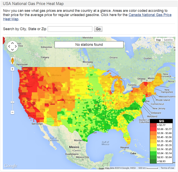
Heat Map
A heat map is a graphical representation of data that uses a system of color-coding to represent different values. Heat maps are used in various forms of analytics but are most commonly used with maps or to show user behavior on a website or specific web pages. The example above shows gas prices across the U.S. using heat map technology.
Do these data visualization tools help you to choose the best type of chart for your data? Does your organization need help using charts data to tell your story?