
When it comes to ecommerce, your website’s design can make or break your business. Even if you have the best products, a poorly designed website can send customers running.
Research confirms that 94% of first impressions of a website are design-related. Fail to amaze your visitors with your layout and content, and they’ll flee to your competition in seconds. That’s why nailing your web design is vital for driving sales and building customer loyalty.
Multiple online ecommerce website builders are available in the market that can help you create a website for your online store, but these can’t build a fully SEO-optimized website. You must hire an ecommerce digital marketing consultant to optimize your site and generate good organic results.
In this article, we’ll walk you through eight common ecommerce web design mistakes that can send visitors packing. But don’t worry; we’ll also lay out expert tips and examples to help you avoid these mistakes and create a seamless, user-friendly online experience that keeps buyers coming back for more.
1. Not Enabling Shoppers to Make Visual Comparisons on Category Pages
In the B2C world, people shop with their eyes and their hearts. When shoppers browse your category pages, they’re looking for products that catch their eye. That’s why it’s essential to enable visual comparisons by displaying attractive and accurate images.
When customers can quickly and easily compare products visually, they’re more likely to click through to a product page, leading to higher engagement and conversions.
Here’s how to allow your customers to visually compare the products on your category pages:
- Standardize the images you use for product thumbnails on category pages. Use the same background, lighting, and angle for all product photos.
- Invest in quality photography or use a professional service.
- Keep text descriptions minimal. Too much text can clutter the page and overwhelm the shopper. Instead, let the images do the talking and reserve detailed descriptions for the product pages.
An example of a brand that implements this tactic successfully is Pergola Kits USA, selling pergola and pavilion kits.
On their Cedar Pergola Kits category page, they showcase their products with high-quality, authentic images. Each product is displayed consistently, allowing customers to easily compare and find the perfect pergola for their needs.
Source: pergolakitsusa.com
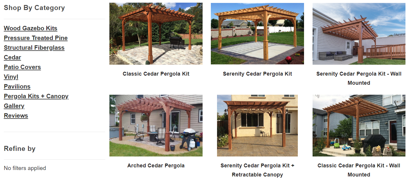
This approach highlights their products while enhancing the shopping experience, leading to higher satisfaction and sales.
2. Over-Reliance on Text for Product Descriptions
Relying too much on text to describe your products can be counterproductive. While detailed descriptions are important, they can overwhelm and deter shoppers, especially when a product’s features are complex.
A more effective approach is to incorporate visual content like videos. Research proves that 82% of consumers are more likely to make a purchase after watching a video. Videos can simplify information, making it more engaging and easier to understand.
Here’s how to avoid over-relying on text:
- Create short, informative videos that highlight and demonstrate key features and benefits.
- Make sure the videos are high-quality and professionally produced, but don’t worry about them being perfect. Authenticity often resonates more with viewers.
- Additionally, use images, infographics, and even 3D product renders to break up text and visually represent information.
Bay Alarm Medical, a brand specializing in medical alert systems, nails this tactic. On their SOS Smartwatch product page, they feature a product video that discusses the watch’s features and benefits.
This is particularly smart because their audience includes older individuals who may not want to read lengthy descriptions. The video simplifies the complex functions of the smartwatch, making it easier for customers to understand and feel confident in their purchase.
Source: bayalarmmedical.com

This approach not only enhances user experience but also increases the likelihood of conversions.
3. Lack of User Generated Content
UGC is a powerful tool for ecommerce businesses. It’s not just about generating social proof (though that’s a significant benefit). It also creates FOMO (fear of missing out) and helps shoppers form an emotional connection with your products.
In fact, studies show that UGC highly impacts the purchasing decisions of 79% of consumers.
Here’s how to leverage UGC effectively:
- Encourage your customers to share their experiences with your products by creating a dedicated space on your website for customer photos, videos, and reviews.
- Offer incentives like discounts or loyalty points for customers who contribute content.
- Make it easy for them to upload their photos and share their stories.
- Showcase this content prominently on your product pages and social media channels. This adds authenticity to your brand and provides potential buyers with real-life examples of how your products are used.
Wholewood Playhouses, a brand that sells wooden outdoor kids playhouses, is a great example here. They feature a customer gallery on their website that displays photos of their playhouses taken by happy customers.
Alongside these photos, customers share descriptions of their experiences.
Source: wholewoodplayhouses.com
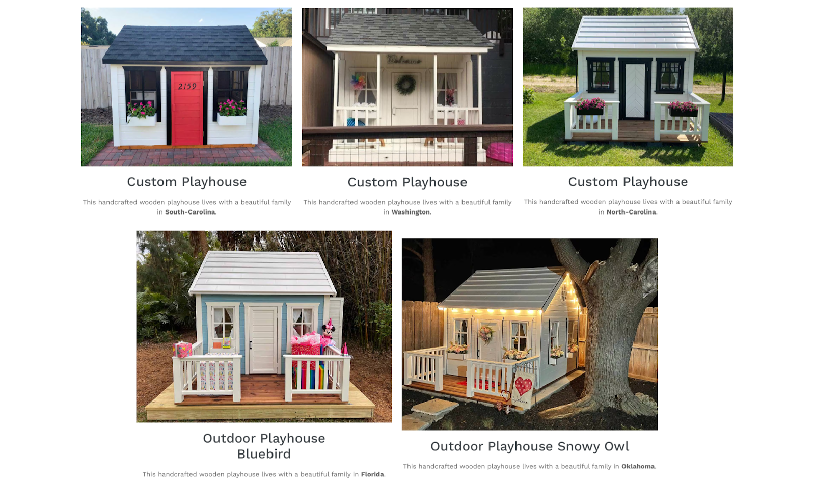
This approach highlights the versatility and quality of their products and inspires other parents to make a purchase.
By showcasing UGC, Wholewood Playhouses enhances the shopping experience and fosters a loyal community around the brand.
4. Not Addressing Common Conversion Obstacles
No matter how compelling your products are, shoppers will always have lingering doubts holding them back from completing a purchase. Many of them hesitate to buy due to concerns about shipping costs, pricing, transactional security, and the store’s legitimacy.
Creating a dedicated section on your website to address these concerns can be very effective. Use visual elements to make this information easily digestible. For example, trust badges and security icons can quickly reassure customers about the safety of their transactions.
Here’s how to overcome some well-known conversion obstacles:
- Display clear information about shipping costs, including any free shipping options, directly on your product and category pages.
- Highlight your best price guarantees and any competitive pricing you offer.
- Emphasize transactional security by showcasing secure payment icons and certificates.
- Build trust by displaying customer reviews, star ratings, and trust badges prominently.
Greenhouse Emporium, a retailer of gardening and greenhouse supplies, effectively tackles conversion obstacles on their Small Greenhouses category page.
At the bottom of the page, they have a section called “Don’t Take Our Word For It!” Here, they address common concerns with star ratings, customer reviews, trust badges, and a secure checkout guarantee.
Source: greenhouseemporium.com
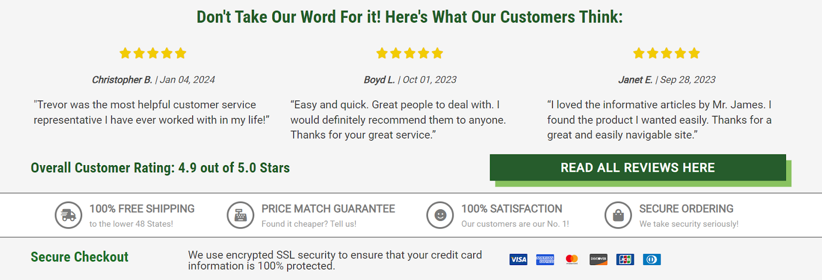
This area is dedicated to overcoming potential barriers to purchase, helping customers feel confident in their decision to buy.
So, address these concerns transparently, and you’ll enhance trust and encourage more conversions.
5. Cluttered Product Pages
A cluttered product page can distract and overwhelm potential customers, leading to lower conversion rates.
To maximize conversions, it’s essential to present information clearly and concisely, ensuring that call-to-action buttons (CTAs), images, reviews, and trust badges stand out. Clean, organized product pages help guide the shopper’s focus toward making a purchase.
Here’s how to declutter your product pages:
- Prioritize the most critical information and minimize UI clutter.
- Display high-quality images, concise product descriptions, and prominent CTAs.
- Keep additional information like detailed descriptions, ingredient lists, and usage instructions collapsible or in dedicated tabs. This way, customers can access the information they need without feeling overwhelmed by excessive details upfront.
Transparent Labs, a brand specializing in natural sports nutrition supplements, masterfully implements this tactic.
On the product page for their Vegan Weight Gain supplement, they opt to collapse non-vital information into dedicated UI areas. Shoppers can click on tabs for ingredients, usage instructions, and other details if they want to read them.
Source: transparentlabs.com
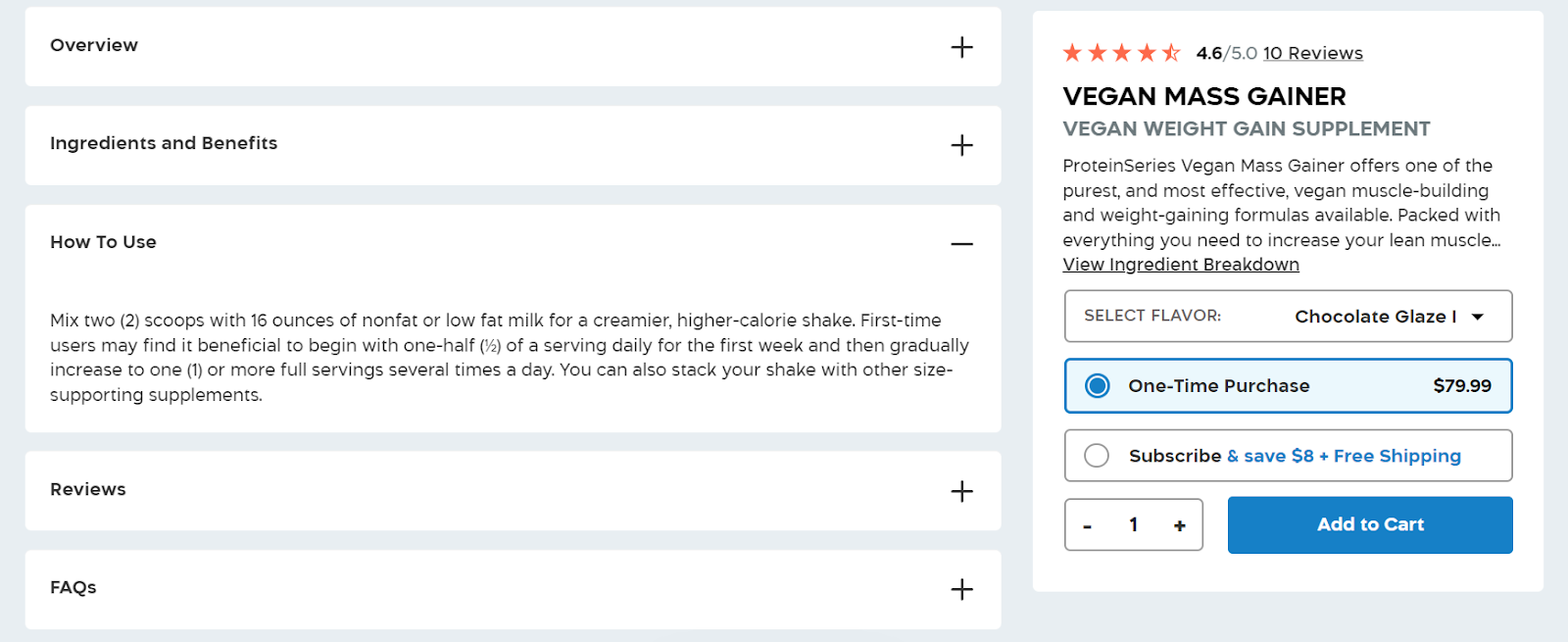
By not displaying all this extra information by default, Transparent Labs keeps the product page clean and focused on conversion. It’s a streamlined approach that ensures that essential elements like CTAs and trust badges pop, making it easier for customers to make informed purchasing decisions.
This is another great tactic for enhancing the user experience and increasing the likelihood of conversions.
6. Not Featuring Related Products
Cross-selling and upselling are gold mines for increasing average order value and customer lifetime value. That’s why featuring related products is a powerful tactic for increasing sales and improving customer experience.
By suggesting similar items, you can help customers discover products they might not have found on their own. This helps boost the chances of making a sale while enhancing the shopping experience by providing personalized recommendations.
Here’s how to suggest the right products:
- Implement a “Similar Items” or “Related Products” section on your product pages.
- Ensure that the recommended items are genuinely relevant to the product being viewed.
- Use data-driven algorithms to analyze customer behavior and suggest items based on browsing and purchasing patterns.
- Make sure the related products are displayed with clear images, brief descriptions, and easy access to add to the cart or wishlist.
Mejuri, a fine jewelry brand, is on point with this strategy. On their Spheres Bracelet product page, they feature a “You might also like” section.
Here, similar products are displayed, offering customers alternatives if they have second thoughts about the initial product.
Source: mejuri.com
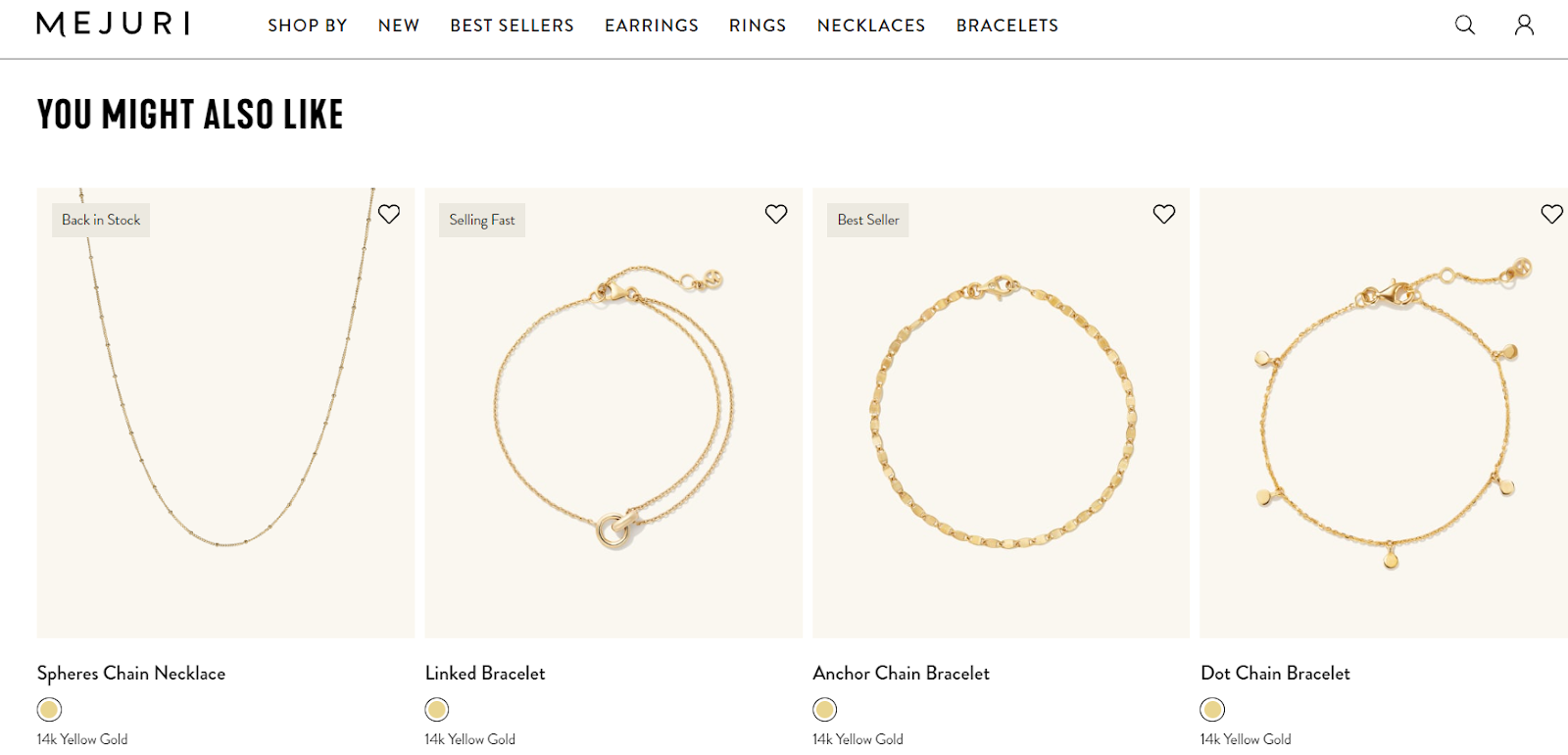
This approach not only increases the likelihood of a purchase but keeps customers engaged with the brand at the same time.
Using this method, Mejuri allows customers to find what they’re looking for. This ease of use enhances satisfaction and drives more sales.
7. Lacking Advanced Search Options
When talking about ecommerce, basic search boxes that merely list matching pages fall short. A smart search function that autocompletes keywords and displays suggested products in real time can significantly improve customer satisfaction and increase sales.
Advanced search capabilities analyze partial keyword entries in real time, instantly surfacing relevant product suggestions and categories.
This predictive approach saves shoppers time while increasing visibility for your catalog. The easier it is for people to find what they want, the higher your conversion rates will be.
Here’s how to win with your search bar:
- Use an autocomplete feature to suggest popular search terms as customers type.
- Integrate real-time results that show product images, prices, and brief descriptions, making it easier for customers to find what they’re looking for quickly.
- Additionally, refine the search algorithm to prioritize relevance and accuracy, providing users with the most suitable results.
Title Boxing, a brand specializing in boxing equipment, exemplifies this tactic very well. Their website’s search tool suggests products and provides real-time results as soon as a visitor starts typing.
This feature helps customers quickly locate specific items, leading to a smoother shopping experience and higher conversion rates.
Source: titleboxing.com
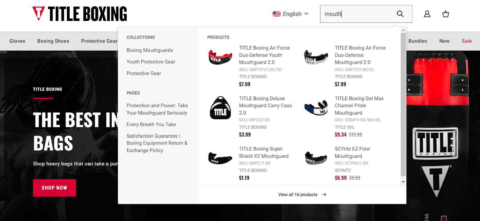
By offering advanced search options, Title Boxing ensures customers can efficiently find the products they need, enhancing their overall experience and boosting sales.
8. Not Optimizing for Mobile
Ensuring your website is optimized for mobile is non-negotiable in today’s mobile-first world.
Considering mobile devices are responsible for over 60% of ecommerce traffic, a responsive design can significantly enhance user experience and increase sales. A well-optimized mobile site ensures that customers can easily navigate, browse, and make purchases, regardless of the device they use.
Mobile optimization goes far beyond just having a website that “looks ok” when viewed on a phone. It’s about crafting an experience specifically tailored to these portable devices’ unique constraints and user behaviors. This means distilling layouts to only the most essential elements, enlarging tap targets, and streamlining navigation.
Here’s how to optimize your ecommerce store for mobile:
- Focus on creating a responsive design that scales seamlessly across various screen sizes.
- Prioritize fast loading times and an intuitive layout.
- Simplify navigation and minimize the use of large images or excessive text that can clutter small screens.
- Ensure that buttons and links are easily clickable and that the checkout process is streamlined and user-friendly.
Petsy, a pet food and accessories brand, does a great job in this department. Their website scales perfectly to all types of devices, especially mobile.
The mobile experience is optimized to be intuitive, with only the necessary elements present. This uncluttered design emphasizes the products and facilitates easy browsing and purchasing.
Source: petsy.online

This way, Petsy provides a smooth and enjoyable shopping experience, leading to higher customer satisfaction and increased sales.
Follow their approach. Optimize for mobile and keep pace with mobile shopping trends, and you’ll be able to capture a broader audience and boost your conversion rates.
Final Thoughts
Don’t let easily fixable website design flaws hold your ecommerce business back any longer.
So, take the next step today – review your website, identify areas for improvement, and start making changes that will set you apart from the competition. Put these actionable tips into practice and allow your visitors to turn into loyal, satisfied buyers.