
Your homepage is likely the first point of contact a lead will have with your brand. This is your chance to make a connection and captivate them.
Engaging someone who lands on your website for the very first time might seem like a daunting task. However, there are a few key elements to include on your homepage that will naturally boost your appeal. In no particular order, they are:
An Emotional Hook
Arguably the best way to engage a first-time visitor is to spark a strong emotional response. This doesn’t necessarily mean you need to make your audience cry or burst out laughing. You are looking for subtler emotions that will help build trust and lay the foundations for a prosperous future relationship.
This tactic is particularly effective in the B2C space, where customers want to connect with brands.
Start by considering what your brand values are. What is it you can offer your audience? Distill your goals and mission down into a couple of words. Then, consider what you want the audience to feel when interacting with you. Do you want them to feel safe? Would you like to reflect your quirky nature?
Finally, you’ll need to find a way of aligning your homepage design and copy with these emotions. You need a header that will resonate with first-time visitors. A clear statement that clearly describes what they can expect from your brand.
FOCL, a functional wellness CBD brand, has chosen a very simple message, for example. Their catchphrase is “self care is self-love”. They emphasize the need to take care of yourself and slow down, especially in times of stress.
This emotional hook is likely to resonate with a large portion of their audience. Most people looking for their product want to relax and de-stress. The header will make them feel heard and seen.

Source: focl.com
A Clear and Simple Value Proposition
In the B2B space, you can adopt a completely opposite approach to the emotional hook: writing an incredibly simple and straightforward value proposition.
B2B buyers are quite different from casual B2C shoppers. They don’t have time to get emotionally invested in a brand. They want to build relationships, yes, but relationships that can be greatly beneficial to their business. They don’t value emotional and cute messaging. They want to know whether or not your product or service holds up in the real world.
You can adopt the same principle as in the example above. Distill your core values and the benefits of your solutions down into a couple of key messages. Frame them in as few words as possible. Clearly highlight what a buyer can expect from you in tangible, easy-to-understand words.
Vivion, a bulk ingredients manufacturer, does a great job with its value propositions. They are to the point, and there’s nothing fancy or frilly about them. A first-time visitor will instantly know what to expect: products that are safe, free of contaminants, and ethically sourced.
This is everything a B2B buyer will care about. Is the product good? Does it do what I need it to do? The sooner you provide an answer, the higher the chances they will engage with your website further.

Source: vivion.com
Intuitive and Logical Navigation
In order to promote engagement among first-time website visitors, you need to provide a clear, direct, and quick avenue into your product or service range. You don’t want someone to spend a minute looking for the item they need. The more of their time you waste, the less likely they are to stay.
This is achieved by putting time and effort into your navigational elements, and it’s especially important for brands that have hundreds or thousands of products.
Start by thinking of all the different ways you can slice and dice your product range. What are the most obvious differentiating factors? What does your audience typically search for? What product categories or variables should make it into your main menu?
Moto Machines, a motorcycle accessories ecommerce company, gives their visitors three options. You can shop by brand, type of product, and type of gear. They then segment their product types further into clear categories and subcategories. It’s very easy to find an item, whether or not you have a preferred manufacturer or want to browse the entire stock.
Note that this is not necessarily the way you need to categorize your products, even though it’s what most brands use. You can also sort by benefits or price ranges, type of customer, and so on. You’ll understand your target audience better than anyone else, so you’re the best judge of their pain points.
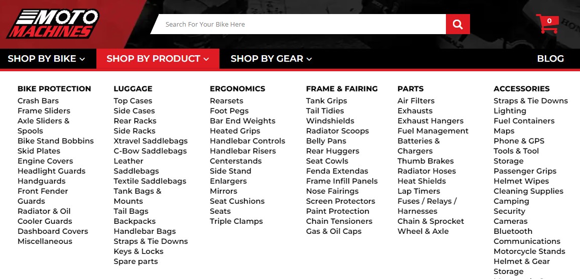
Source: motomachines.com
An Uncluttered View of Your Service Process
If you offer a service that is based on a process, you will need to illustrate it exceptionally clearly. This is the point where first-time visitors will either engage or run for the hills. If they don’t understand what you are actually selling, they will not stick around to decipher your processes.
Ideally, you want to have no more than three steps in your process. Each step should have a clear name and a short description. This is not the time to write long-winded explanations. You want to cut right to the chase. You can provide more details elsewhere.
This is a good time to emphasize the benefits of your service. How will the lives of your customers become easier? What problem can you solve for them? Highlight features like quick, cost-effective, easy, and so on.
Ultimate Meal Plans, a custom meal planning service, does a good job with this tactic. They briefly explain how their meal planning service works. Each step is understandable from its name alone. The description merely adds more information and further highlights the reasons to sign up for this service.
If your process is significantly more complex, try to simplify it as much as possible. Your goal is to get first-time visitors interested and engaged with your brand, which they are unlikely to do if you bore them with lots of complicated steps.
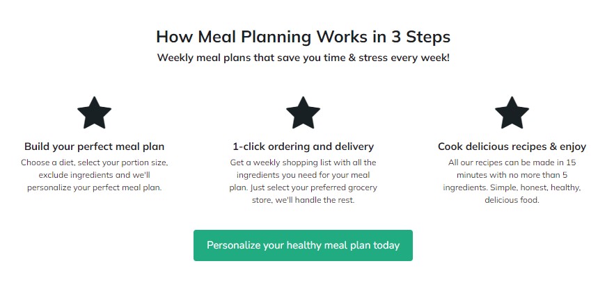
Source: https://ultimatemealplans.com/
Your Current Sale or Offer
Another great way to engage first-time visitors is to clearly promote an offer. This is highly likely to spark their interest. They are obviously already looking for the product or service you offer, otherwise they wouldn’t be on your website. If there is also a code or a discount available, they are going to explore further.
You can adopt this tactic in several ways. You can offer special deals to first-time customers only. This information can be displayed as a pop-up, or it can be featured on the homepage, ideally at the very top, above the menu.
You can also update your header every time there’s a sale or special discount available, either sitewide or on certain products. This is what bedding brand Sheets and Giggles do. They are currently doing a President’s Day sale, which is the first piece of information you encounter on the website.
The fact that they show you exactly how much you are expected to save is a great way to increase engagement rates.
If you don’t have an ongoing sale, you can highlight your loyalty program or any other scheme you have in place that will help customers save money. Do you offer same-day delivery for a certain threshold? Do you reward customers on their birthdays? Make sure a first-time visitor is acquainted with this information as soon as they land.
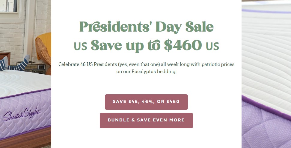
Source: sheetsgiggles.com
Compelling Calls-to-Action
Calls-to-action are a required part of every homepage. They help you inspire a specific action, and they are your best tool for funneling traffic where it should be going.
In order to truly engage visitors, these CTAs need to be carefully thought through and designed. It’s not enough to just say “click here” or “buy now”. These bland CTAs will probably work for repeat visitors and those who are familiar with your brand. Someone who is seeing you for the first time could use a bit more effort.
Let’s look at Toggl, a time tracking software tool, and see what makes a good CTA. First, notice how the design of these two buttons blends in with the rest of the page. The punchy pink is well aligned with the highlights on the rest of the page, particularly with the highlighted word in the value proposition. The white text color stands out against the dark background.
Consider the quality of the CTA copy as well. You’re not told to “start using Toggl.” You’re told you can start tracking time for free. The benefit is unmissable. In case you don’t want to do the free trial just yet, you can check out a video (and you know it’s a video because the tiny play button tells you so) and see how the product works.
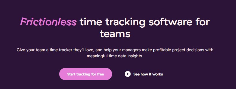
Source: toggl.com
A Variety of Reliable Trust Signals
First-time website visitors will want to be reassured that they can trust you. They want to know that it’s safe to do business with you and that you’re not just some shady brand that won’t deliver on its promises.
There is a simple way to provide these assurances: trust signals. Depending on the nature of your brand, you can use case studies, testimonials, product reviews, third-party reviews, celebrity endorsements, and so on. Take some time to consider which would have the most impact on your customers, and use multiple formats, if possible.
The homepage of Semaphore, a SaaS solutions provider, is filled with different kinds of trust signals, and they work together incredibly well. They present the solution as reliable, efficient, and trustworthy.
First, there is the “customers who trust us” carousel, which proudly displays the logos of some of the biggest brands in the world. You then scroll to their G2 reviews, presented in an easy-to-digest manner.
Further down the page, there are some customer case studies comparing Semaphore with its top competitors. You’re practically guaranteed to trust the product when you scroll all the way to the end.
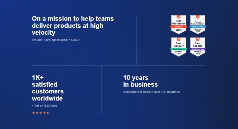
Source: semaphoreci.com
Copy That Truly Reflects Your Values
Finally, let’s briefly touch upon the importance of homepage copy and how it can help you engage first-time visitors.
Ideally, you want the words on your homepage to reflect who you are as a brand. This goes not just for the emotional hook or the value proposition but for every single word you use. You want to paint a highly specific picture and let first-time visitors know exactly what they can expect from working with you.
Do Good Things, a New Zealand based marketing agency, does this very well. They repeatedly use the term “good” to describe things: their work, their staff, and the results they can achieve for their clients. They position themselves as a company that focuses on doing their best, a company that truly cares about both their staff and the brands they work with.
The more you read, the more you notice this customer-centric approach. They reinforce the message from their homepage header with every description and every process breakdown.
This should be your goal as well. Use your words to reflect your values and your worth, and embed yourself in the minds of your first-time visitors as a unique brand that stands behind its claims.
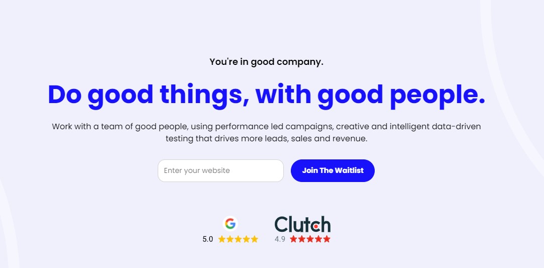
Source: dogoodthings.co.nz
Wrapping Up
Have you already implemented any of these homepage elements? If not, take ample time to consider how you can best utilize them to cater to the needs of your target audience. While they do have a general appeal, it’s important to personalize them and adjust them to the nature of your business.